Spilled milk
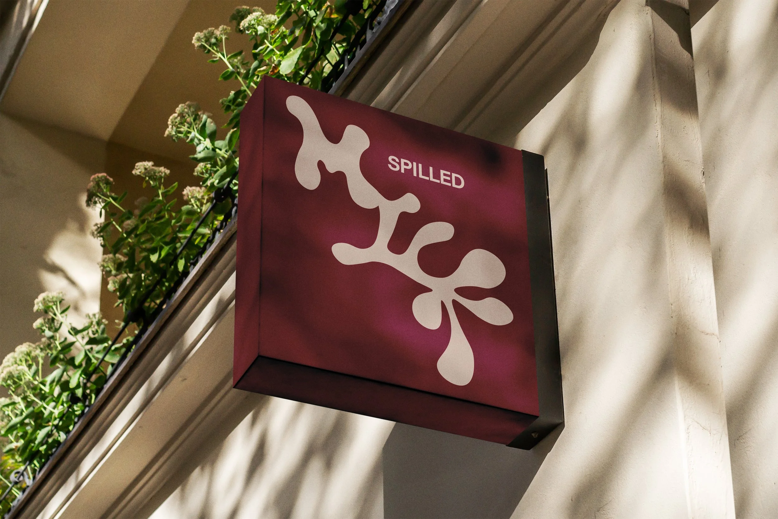
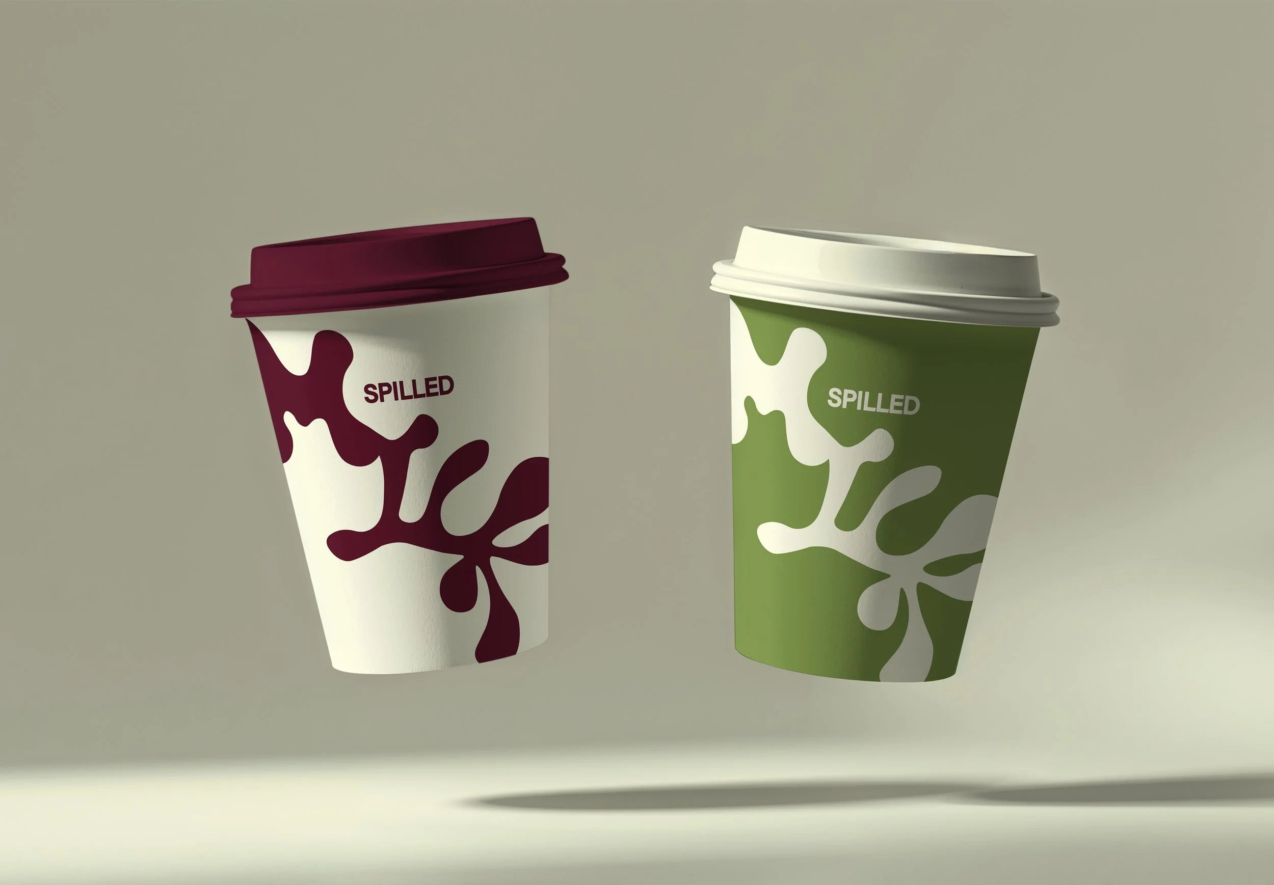
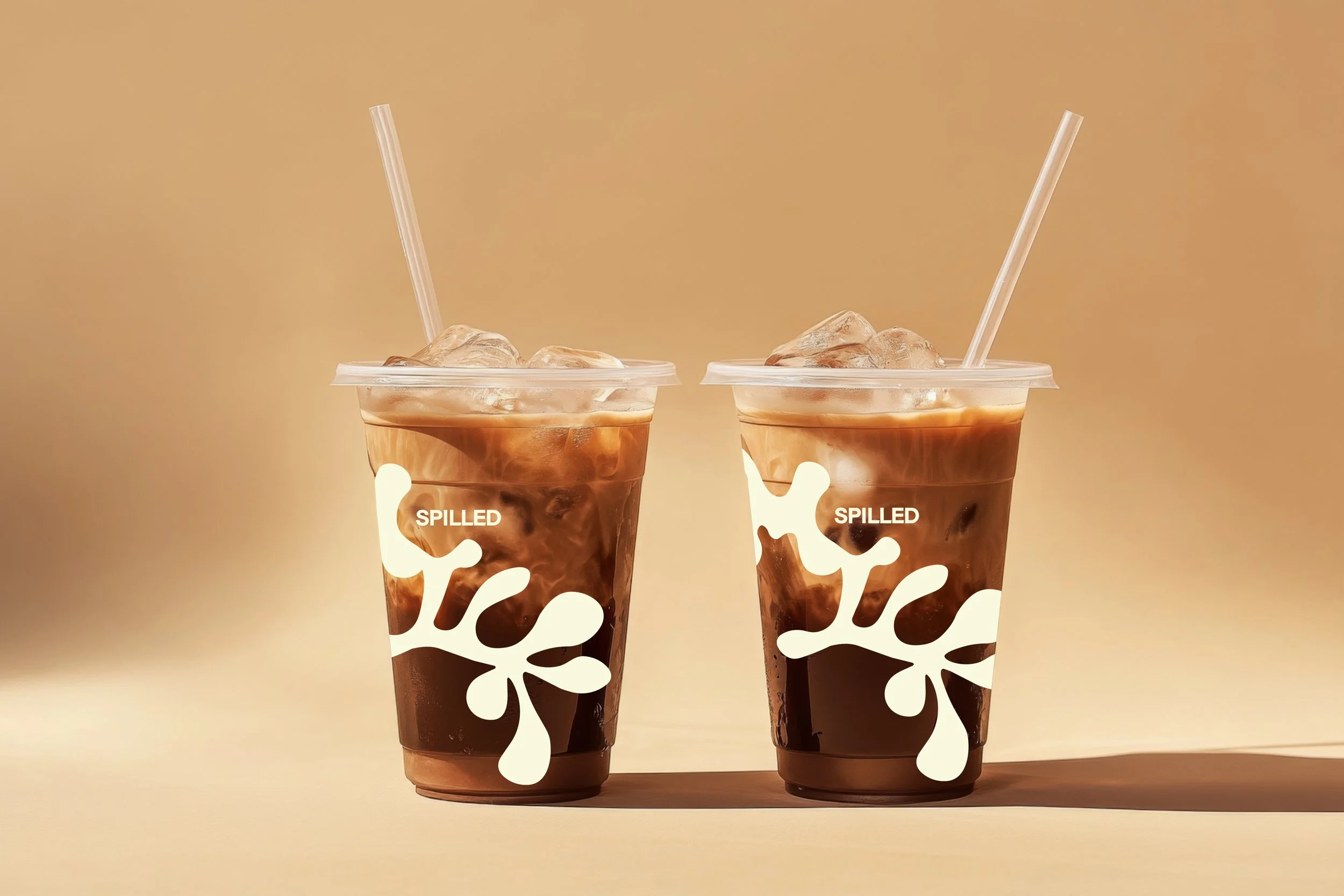
Spilled Milk is a fictional coffee brand and café concept developed for a younger, style-conscious audience, primarily high school and college students. The brand identity balances playful charm with modern elegance, using a palette of bold, fun colors and minimalist design elements. This project showcases branding, visual identity, and environmental design tailored to youth culture and casual sophistication.
Moodboard
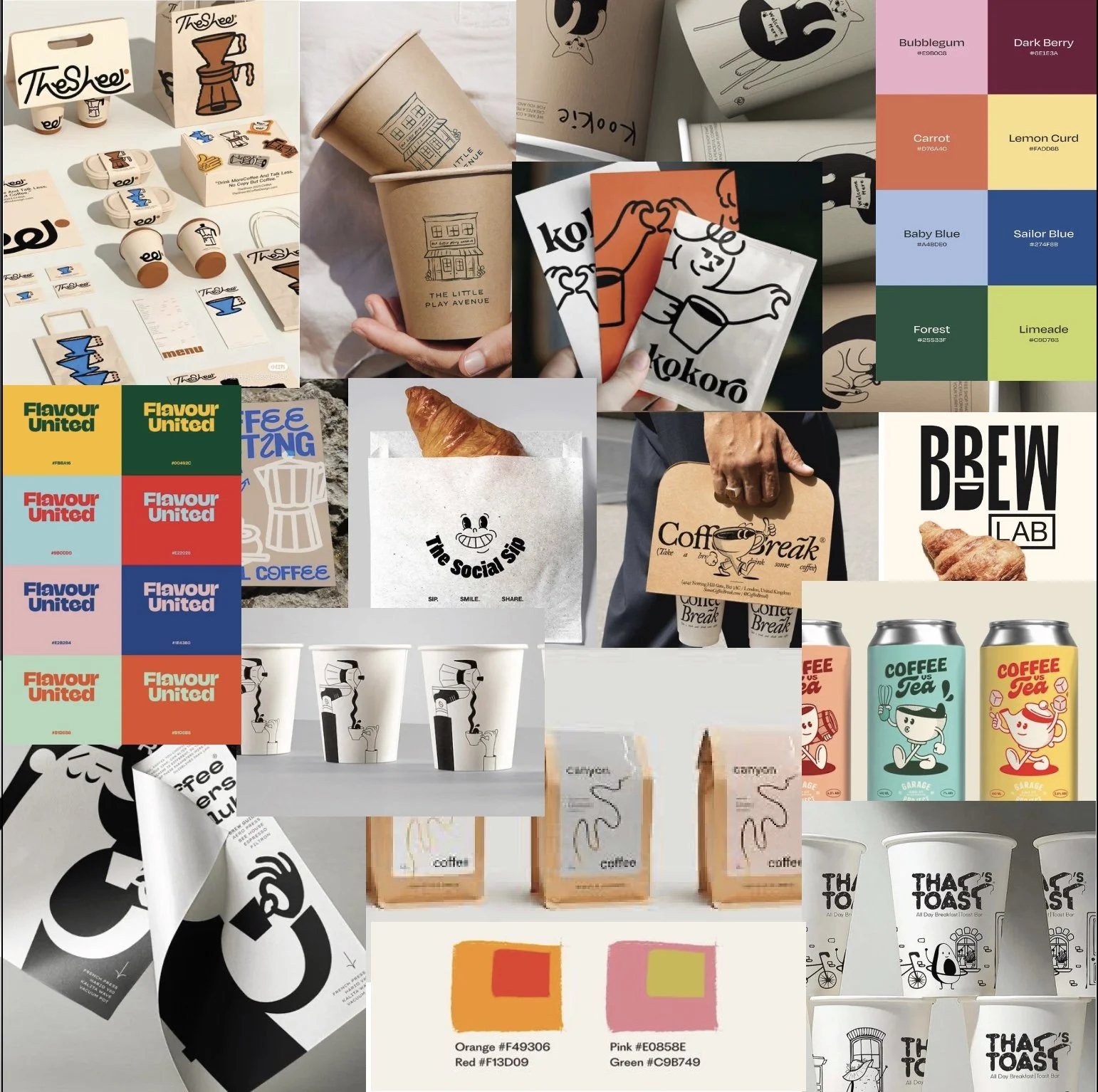
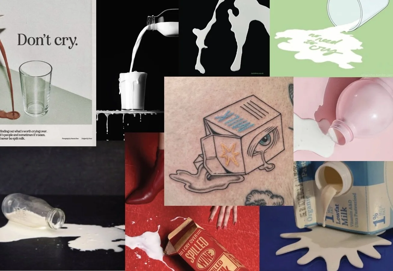
I knew I wanted the branding of this coffee place to be playful and engaging, while also modern and relevant.
wordmark
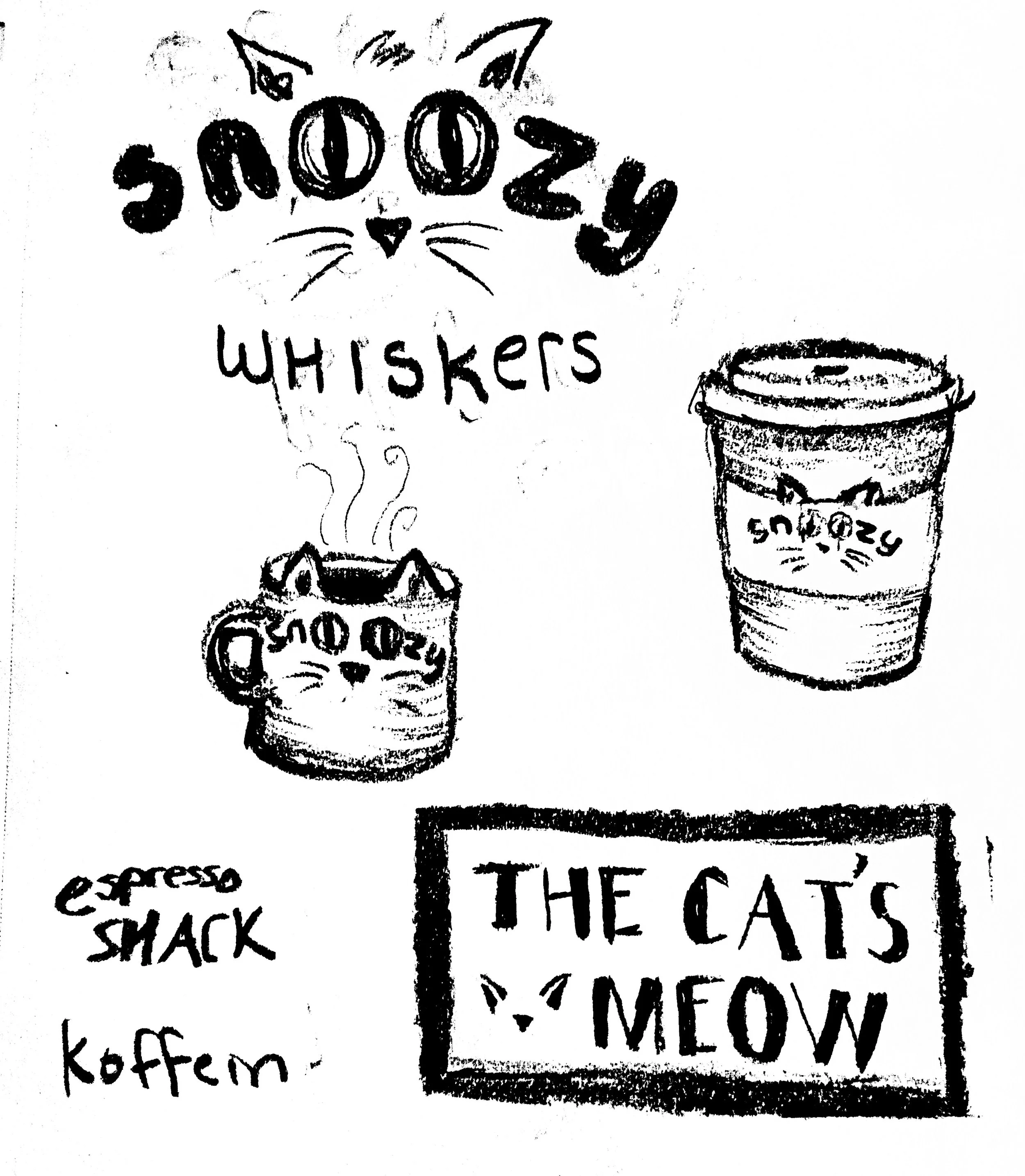
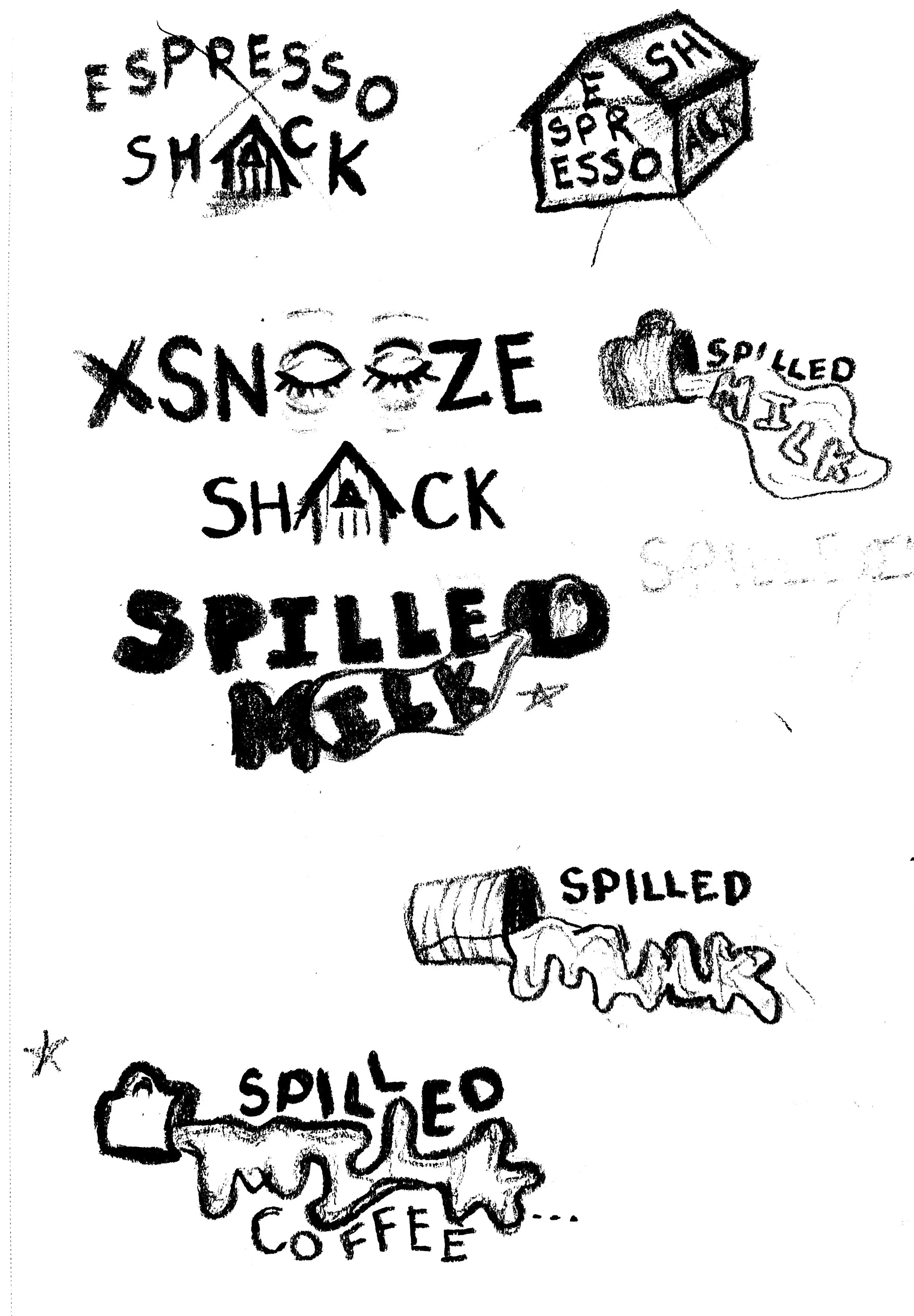
my initial plan was to do a cat café, however after a few concept sketches I changed course. I fell in love with the name "spilled milk" and started iterating from there.
I knew I wanted the word 'milk' to appear as a spill, however I initially struggled to balance intrigue with legibility. I started with a loose image of a cup in the wordmark to emphasize the spill. However, with guidance from my mentor, I scrapped to cup and went in a more bold direction.
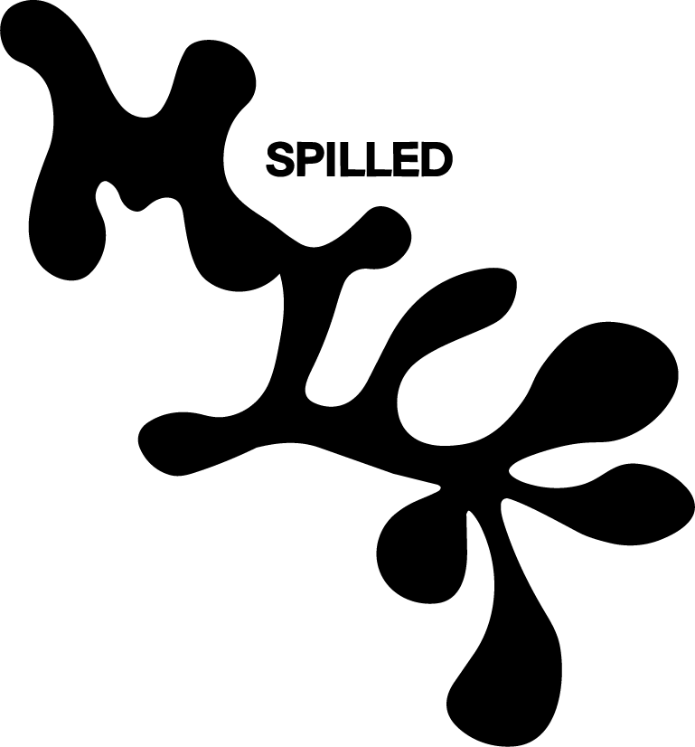
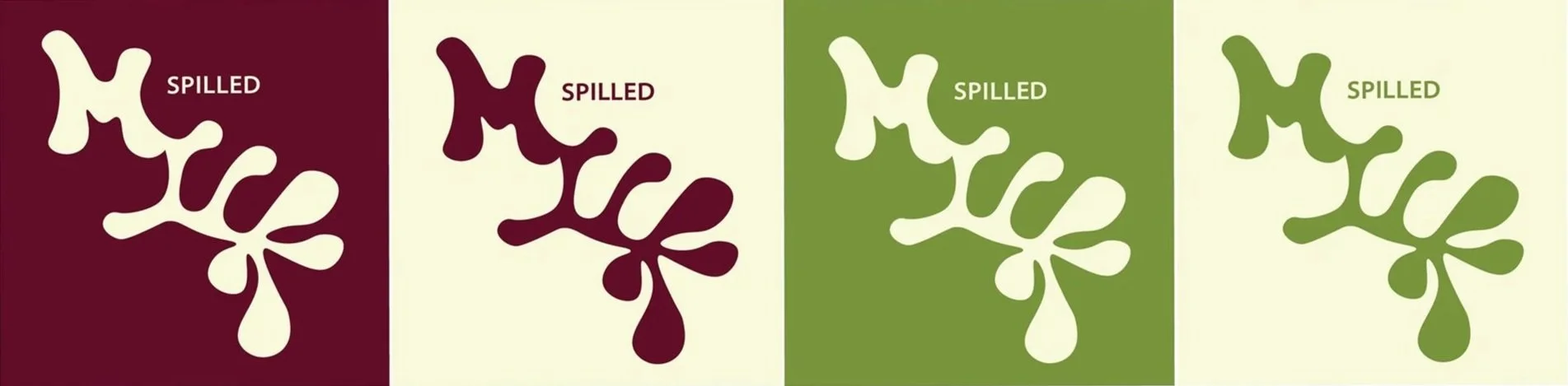
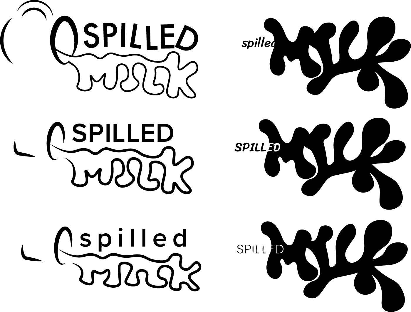
For the final logo, I refined earlier iterations by increasing contrast to improve the wordmark’s legibility. In one version, I wanted the word “spilled” to visually embody its meaning by appearing as though it’s actually spilling. To achieve this, I layered the word into the milk graphic and used contrast to create a seamless, fluid connection between the two elements.
menu
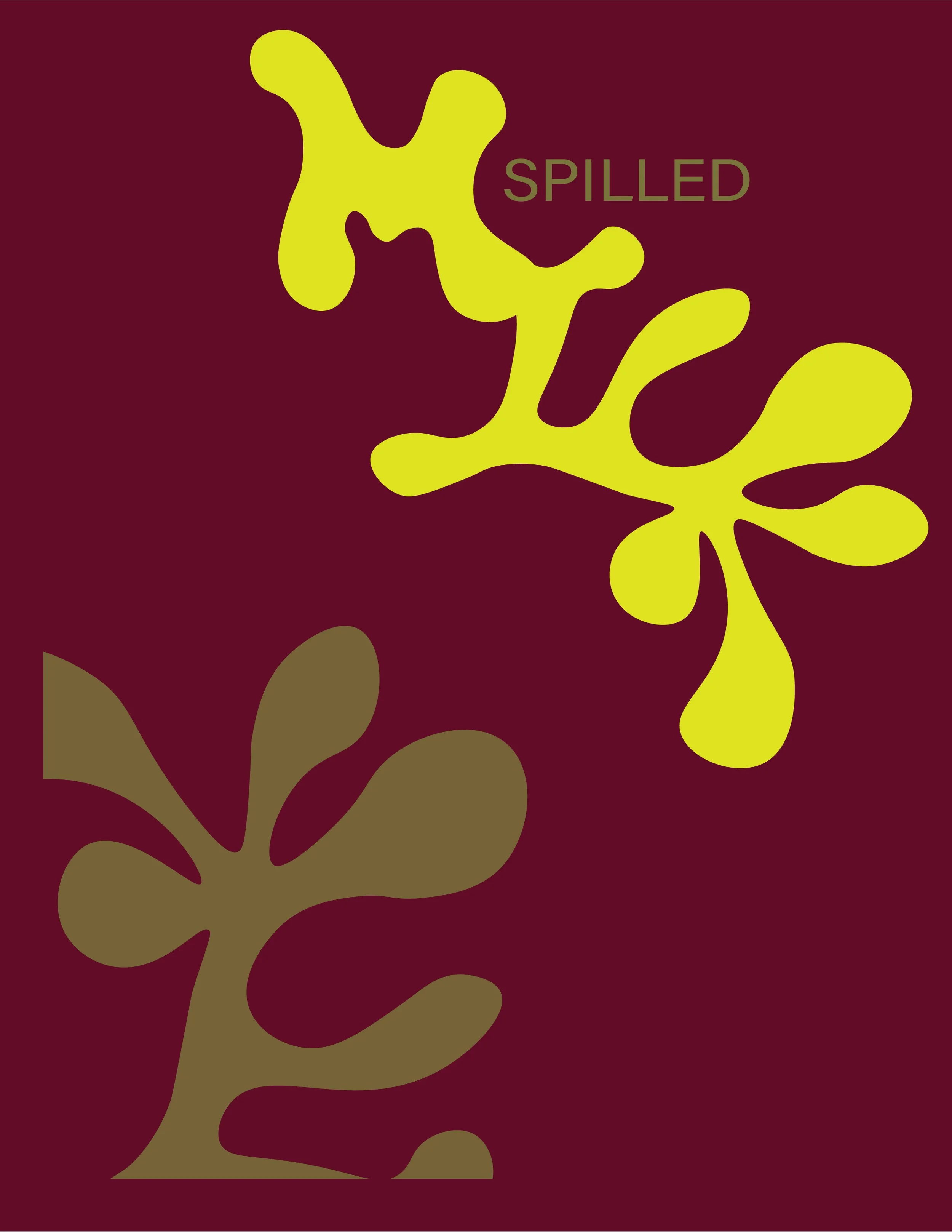
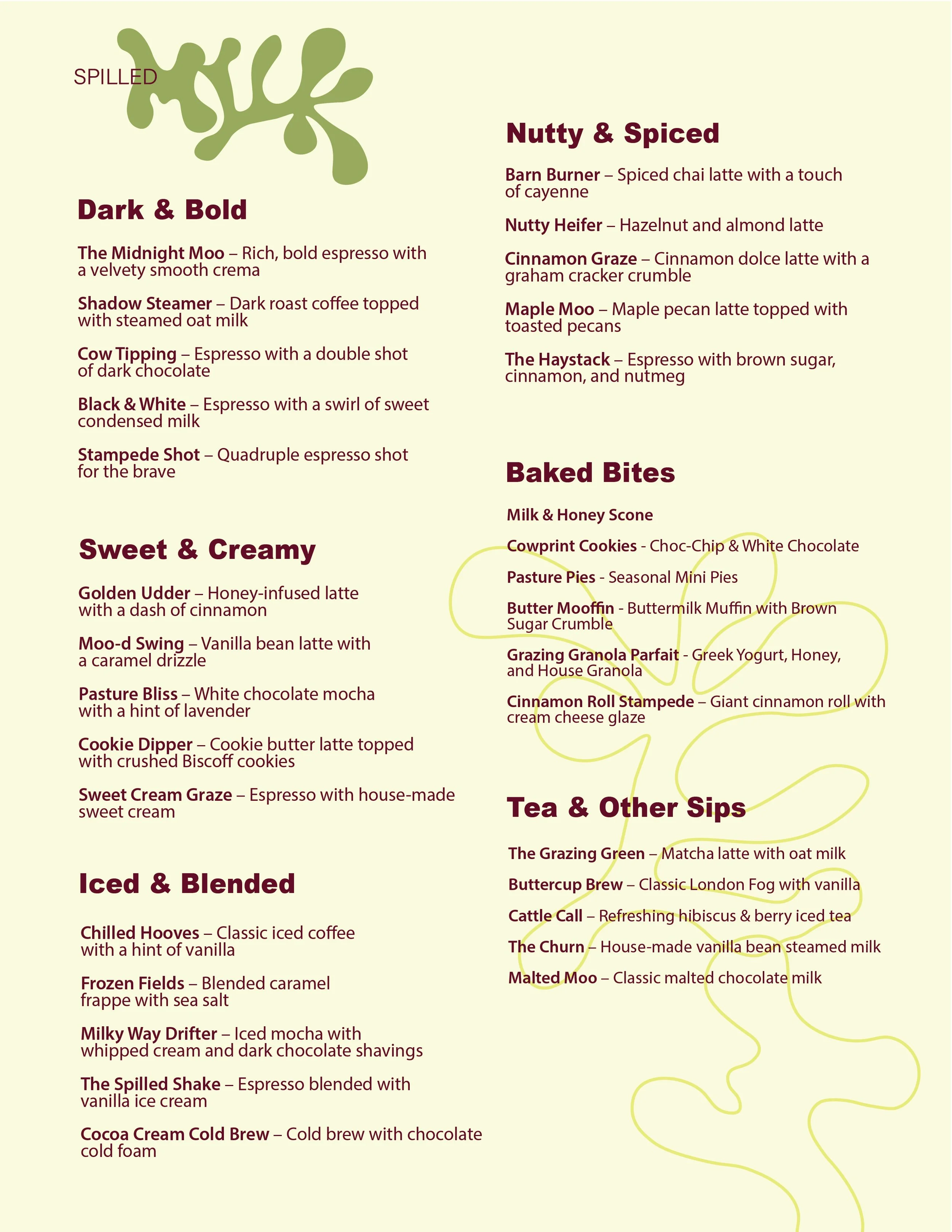
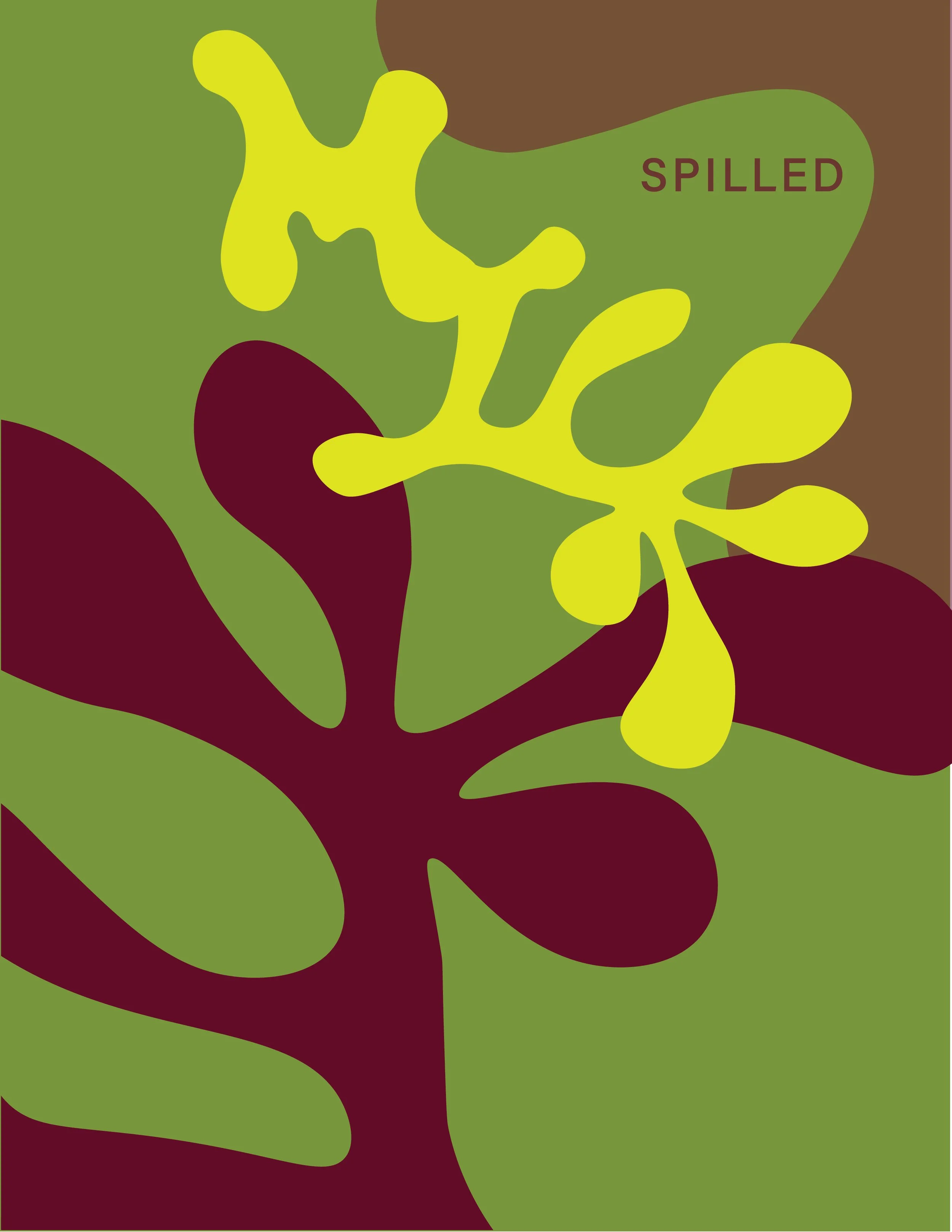
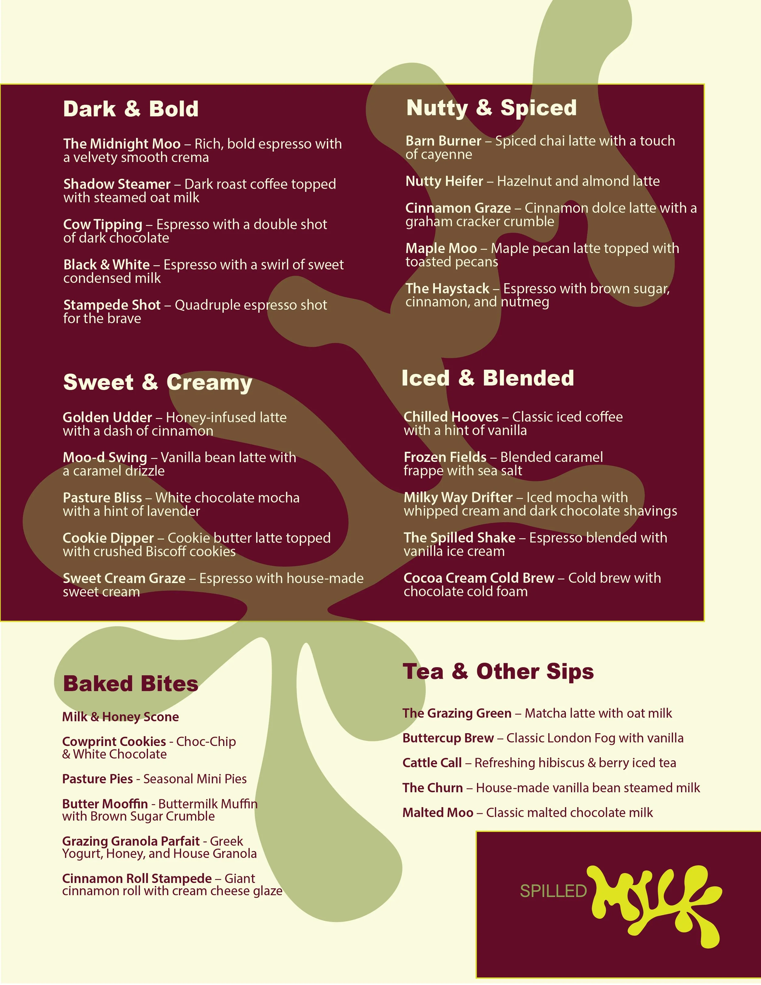
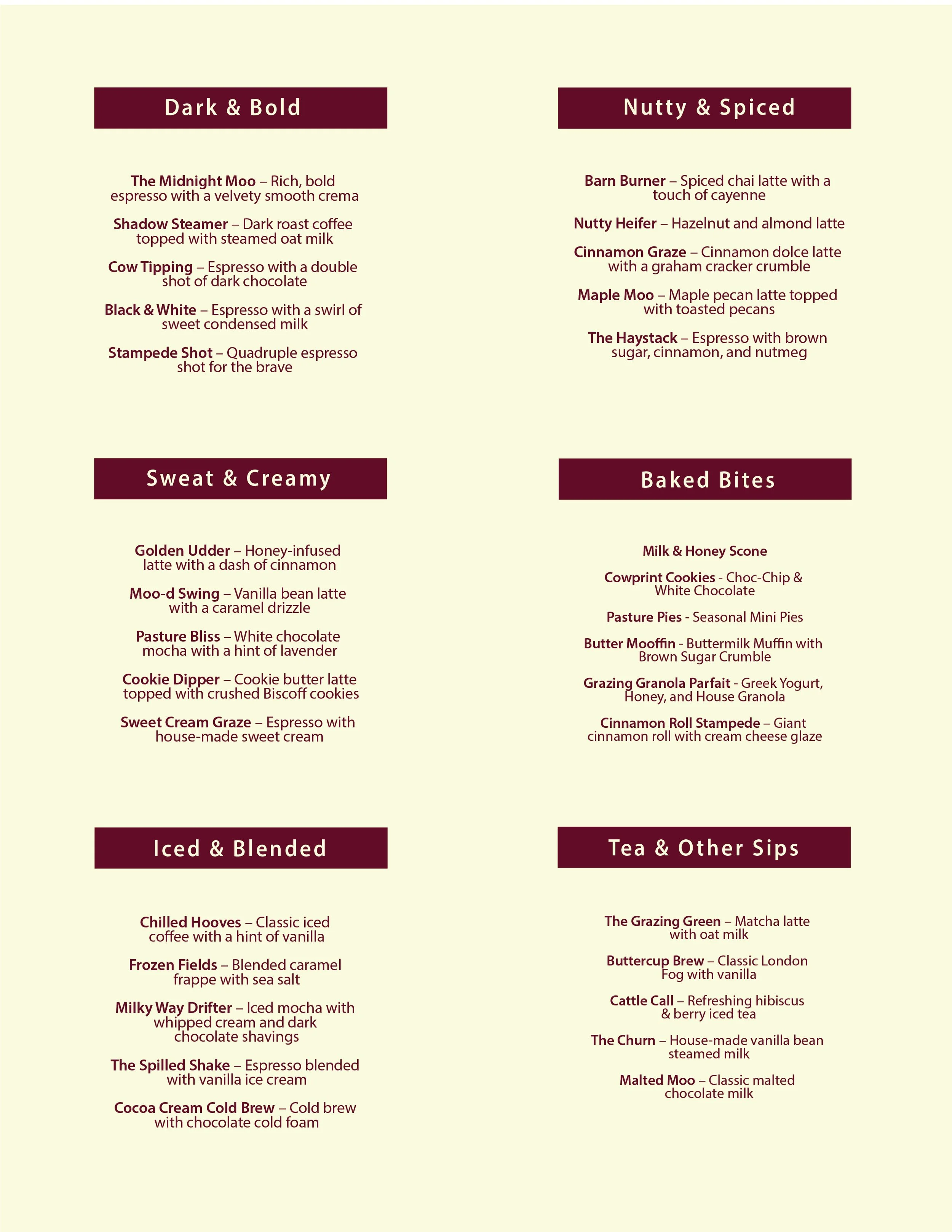
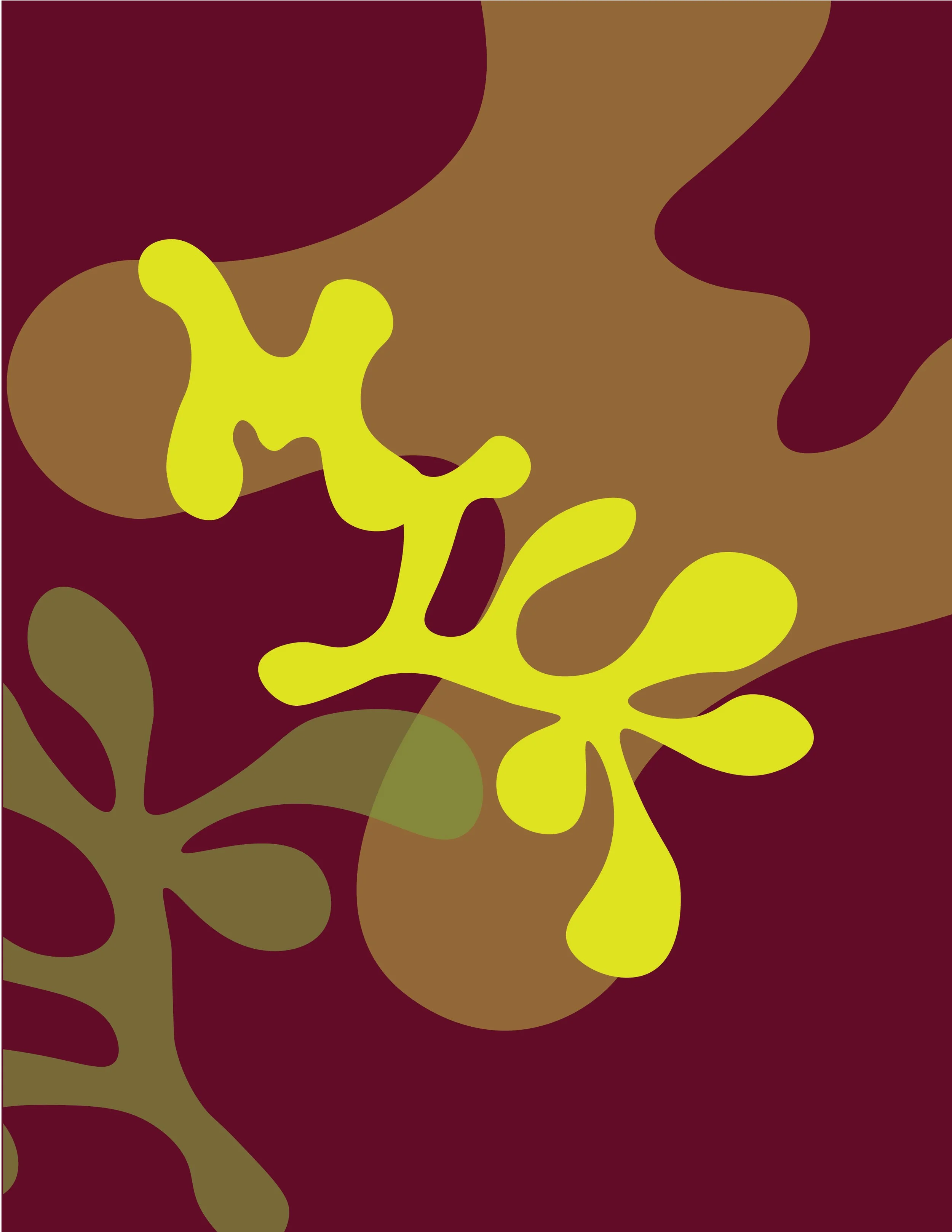
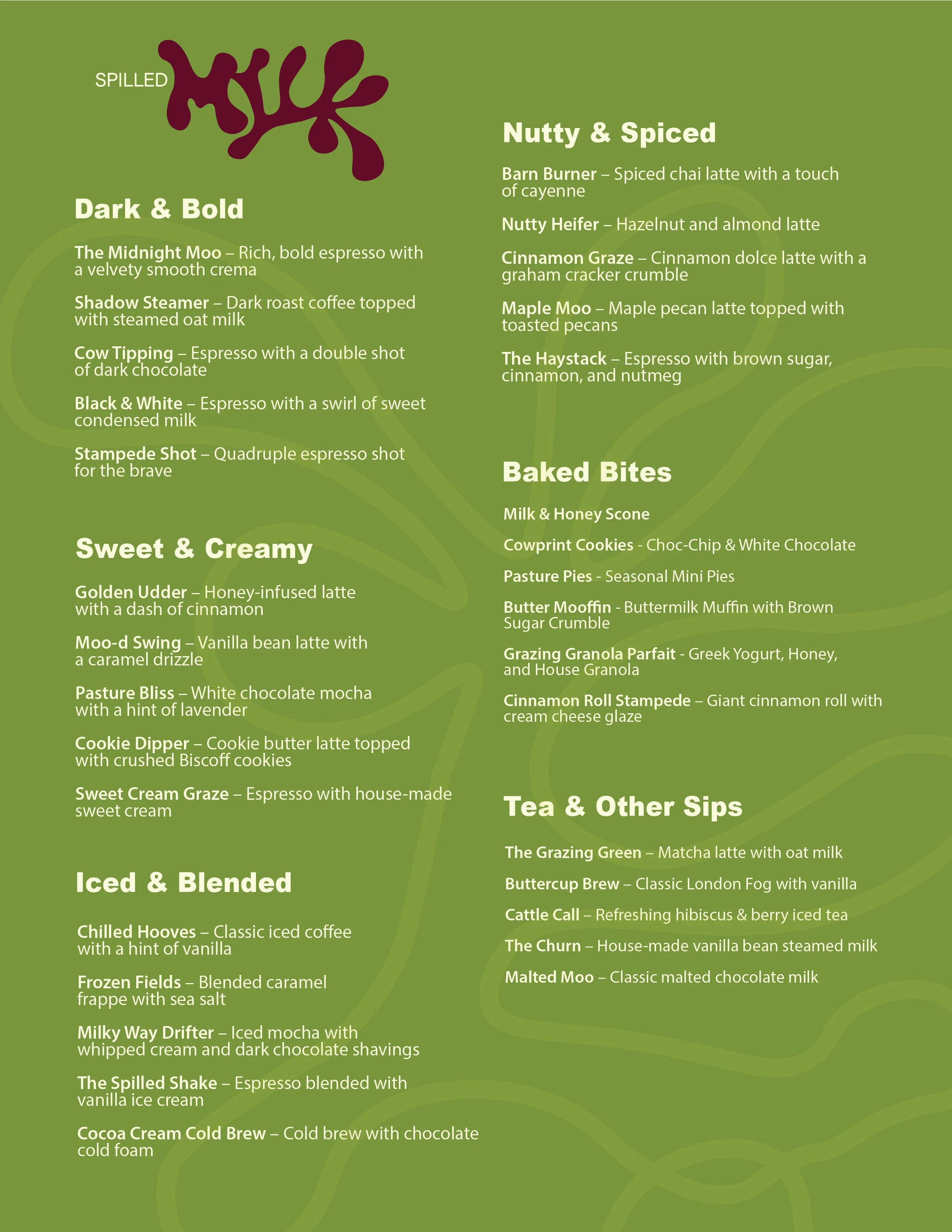
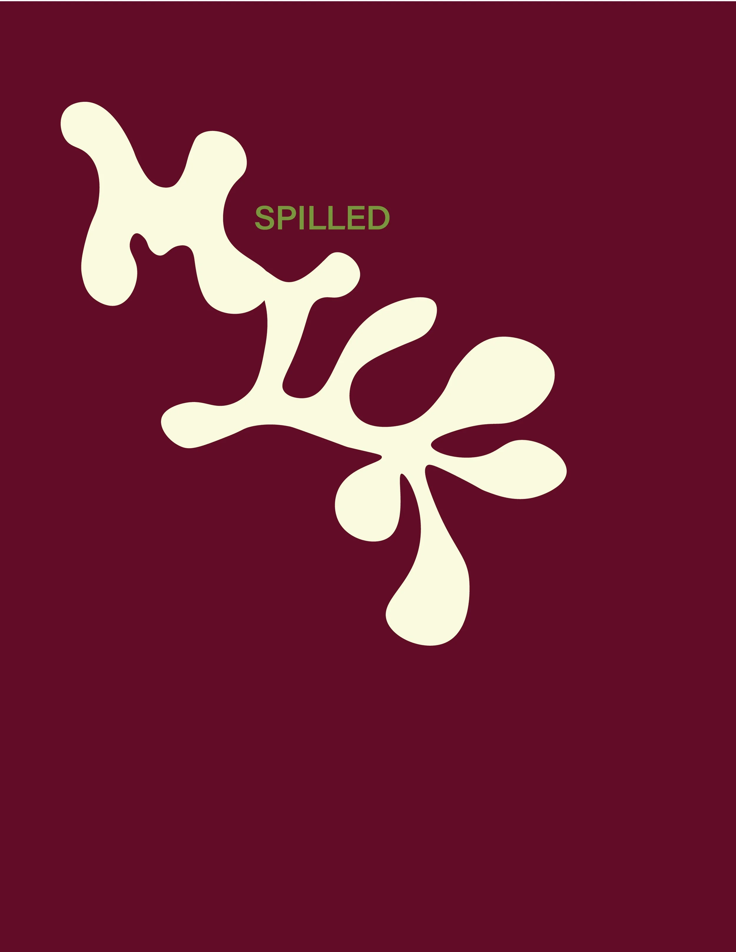
When designing the menu, I experimented with making the logo a graphic element that could activate the pages on the menu, while also making it legible and not overwhelming for possibly costumers
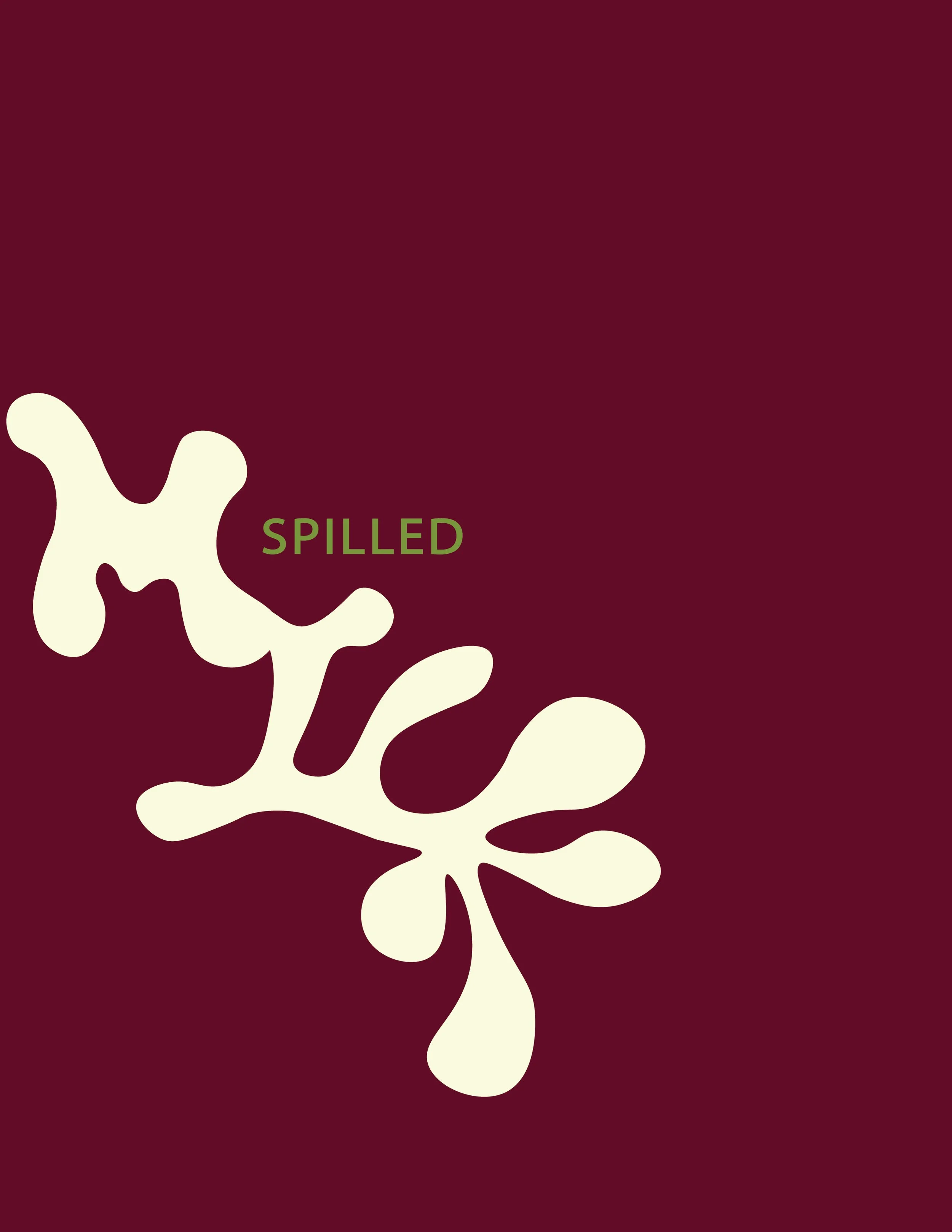
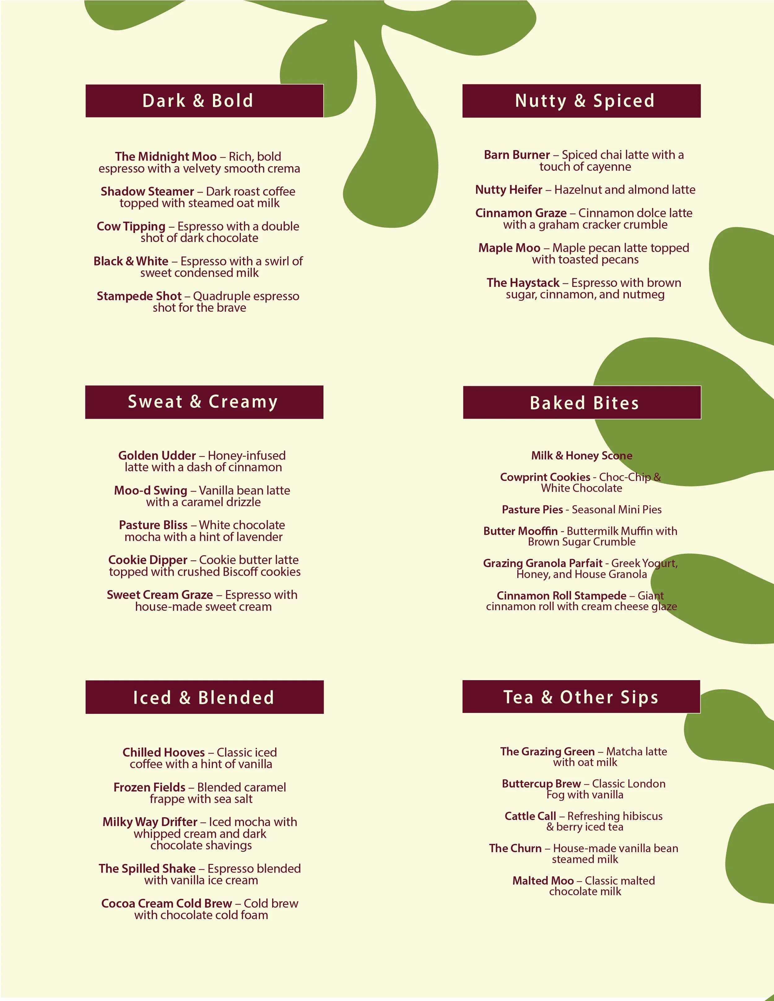
For the final menu, I dialed back the graphic elements on the front page, sticking to a more simple display of the logo. On the menu itself, I made the logo more into a graphic that resembles leaves, while keeping the copy simple and organized.
view more