iyasu
Iyasu is a conceptual skincare brand I created for a Gen-Z audience, with a visual identity built around playfulness and confidence. The design leans into bold colors, fun typography, and an overall energetic feel that mirrors the light, optimistic approach behind the concept. My goal was to create a brand world that feels welcoming, expressive, and uplifting from the very first glance.
Moodboard
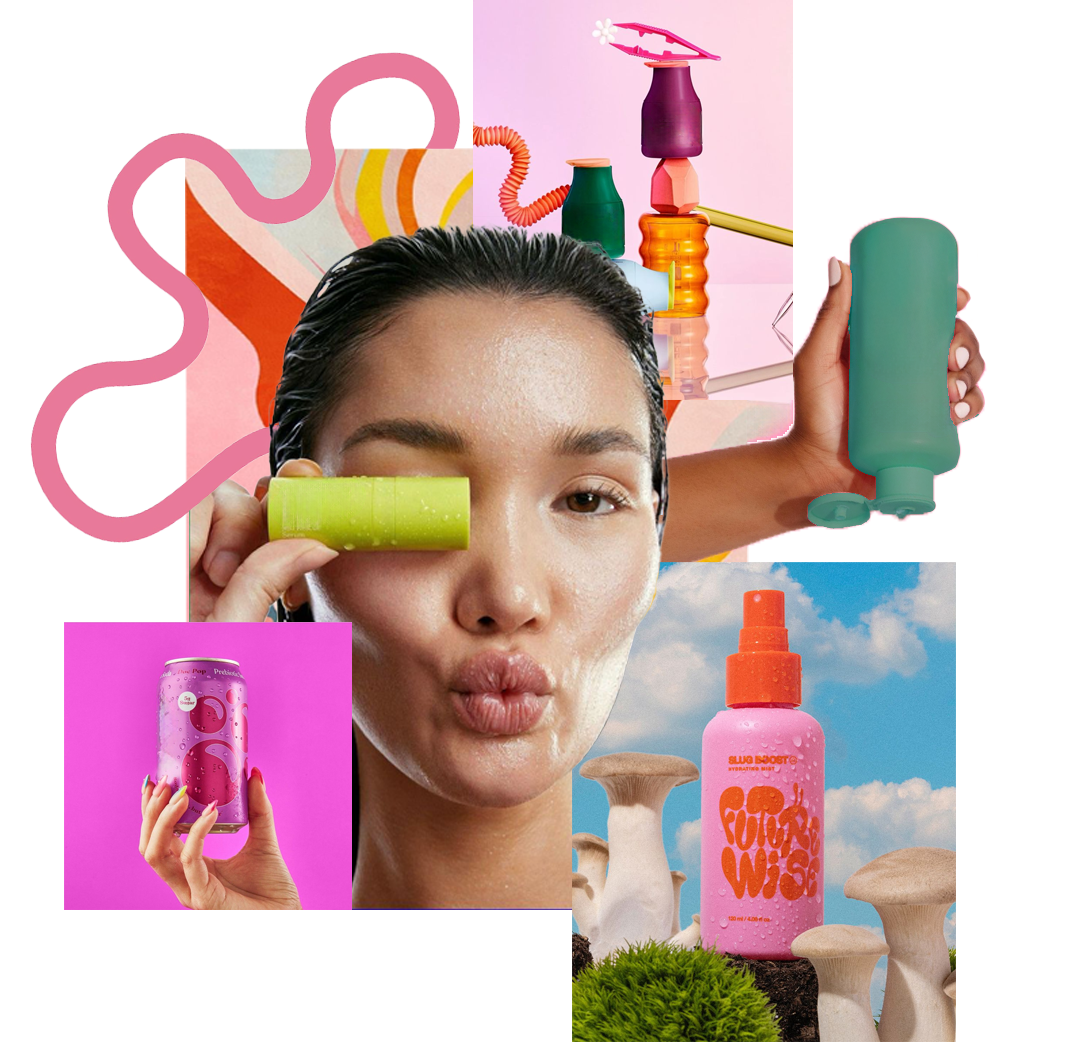
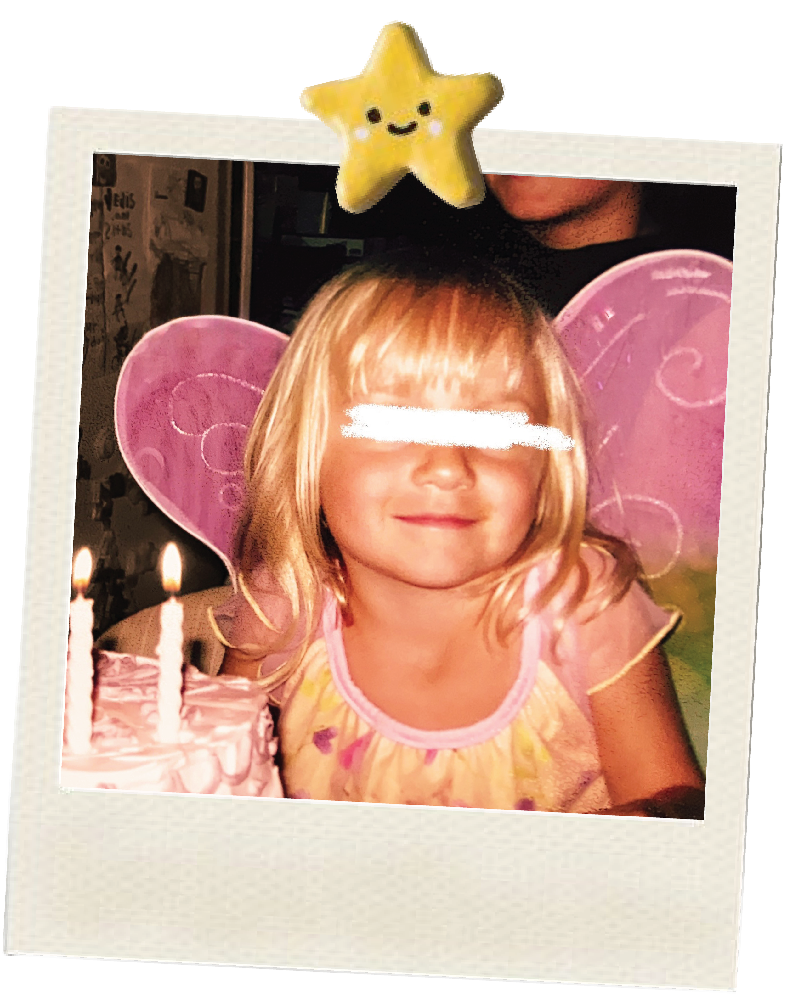
I wanted the moodboard to be a reflection of the brands purpose and identity. I utilized bold colors and playful images to invoke the feeling of confidence and joy.
Brand Story
To Heal, Gently.
At Iyasu, we believe healing should feel good - supportive, empowering, and even a little fun. Inspired by the Japanese word for “to heal,” Iyasu was created to help repair not only damaged, acne-scarred skin, but the relationship you have with it.
Our formulas are designed for those navigating texture, enlarged pores, and the aftermath of overtreated, stressed skin.
Every product reflects our belief that skincare doesn’t need to beharsh to be effective. With gentle, science-backed ingredients and a focus on restoring your skin’s natural balance, Iyasu works with your complexion, not against it.
We’re here to bring ease, optimism, and confidence back into your routine, so you can enjoy the process as much as the results.
Because healing is a journey - and you deserve to feel amazing every step of the way.
Logo

The logo started as a hand drawn image. This was intentional to create an organic, imperfect typeface that is bold and can also be used as a design asset.
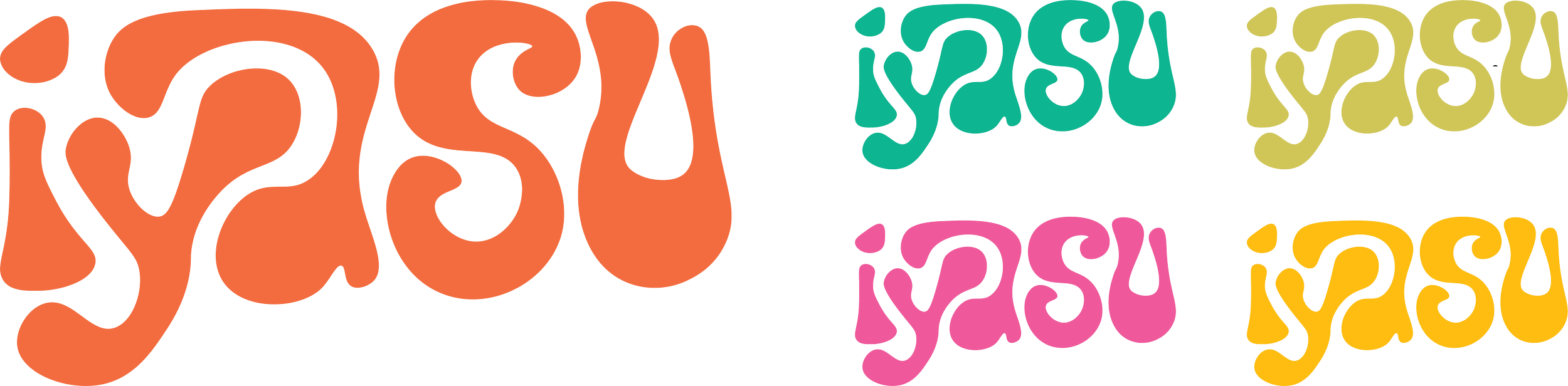
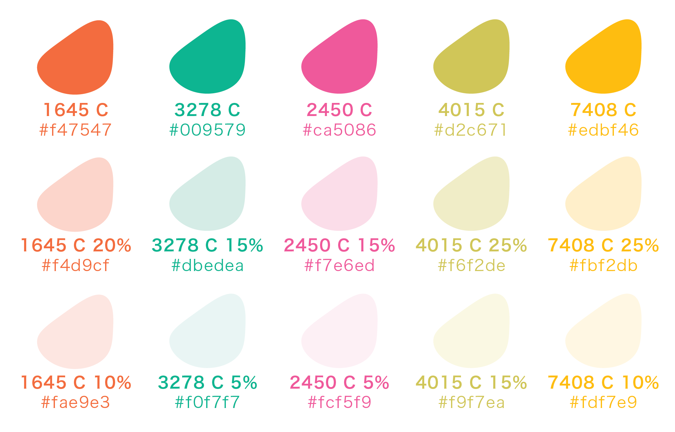
brand elements
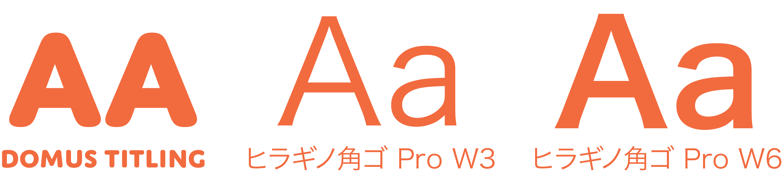
For the brands visual identity, I wanted to use a fun color palette to invoke visual appeal as well as stand out in shelf presence. The typeface for copy is very minimalist and quiet to contrast with the bold logo. I utilized that same logo as a secondary design asset for packaging as well as media.
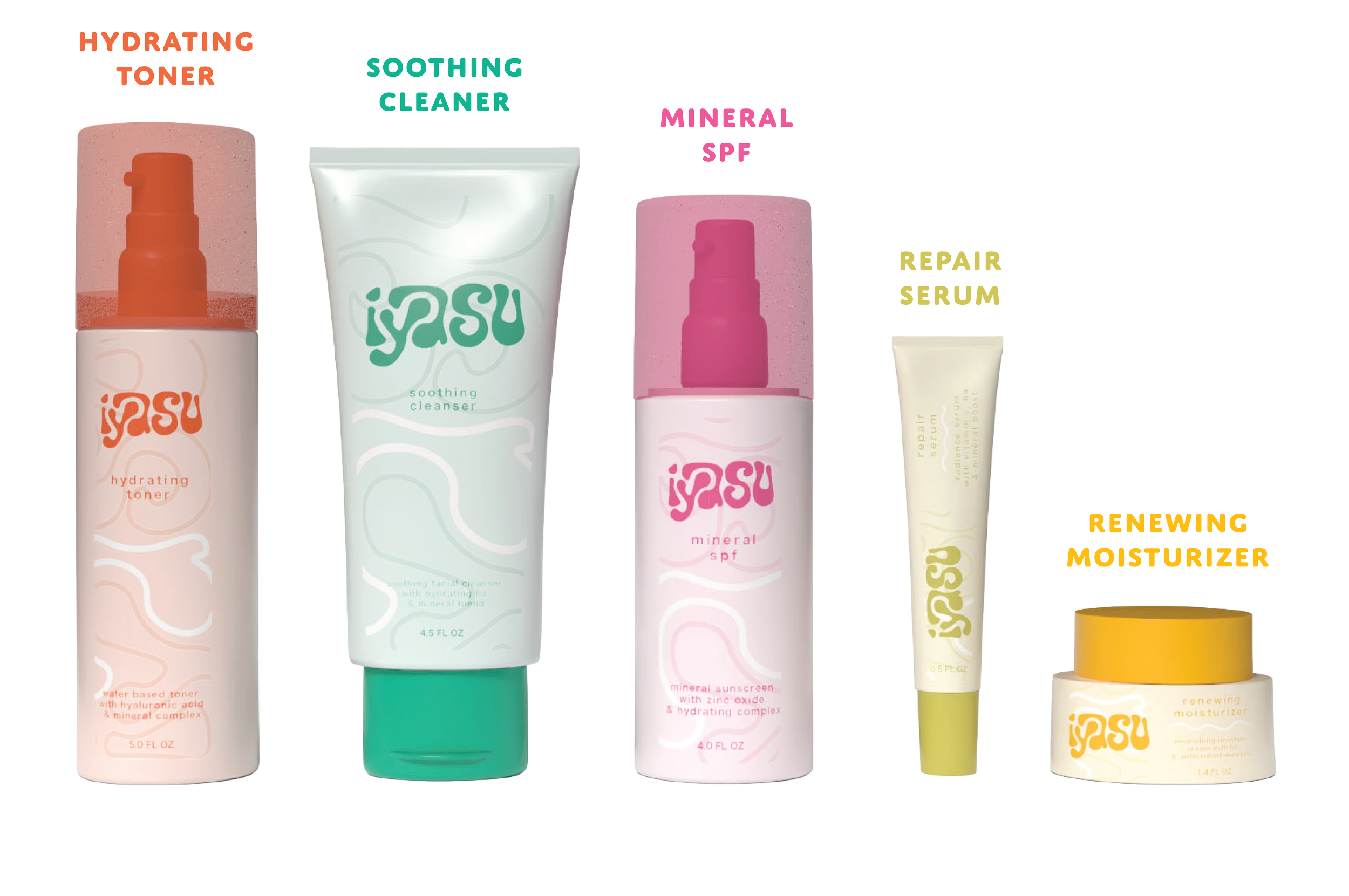
Lineup
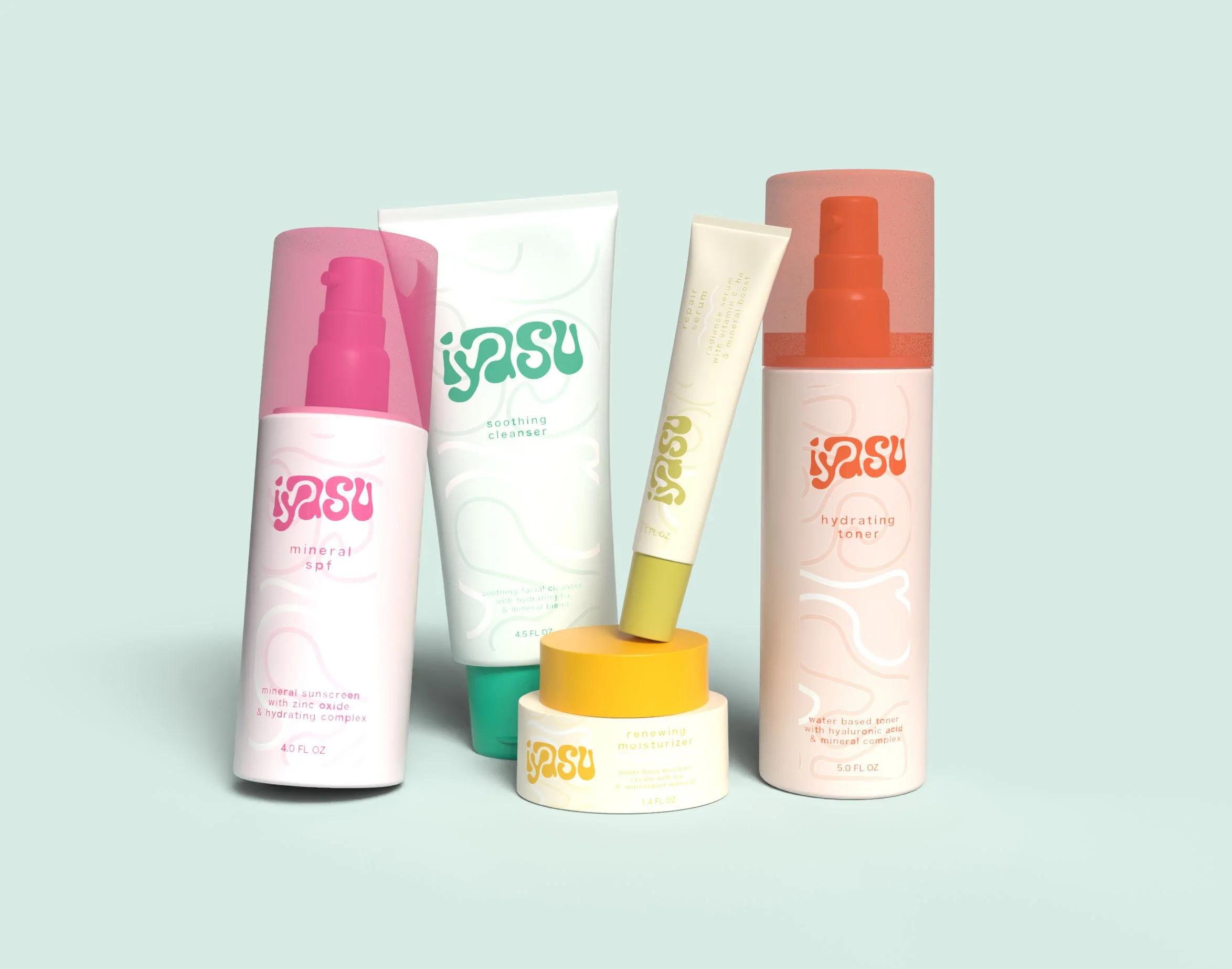
The final product lineup was designed to fit a routine, which each color being dedicated to a specific product.
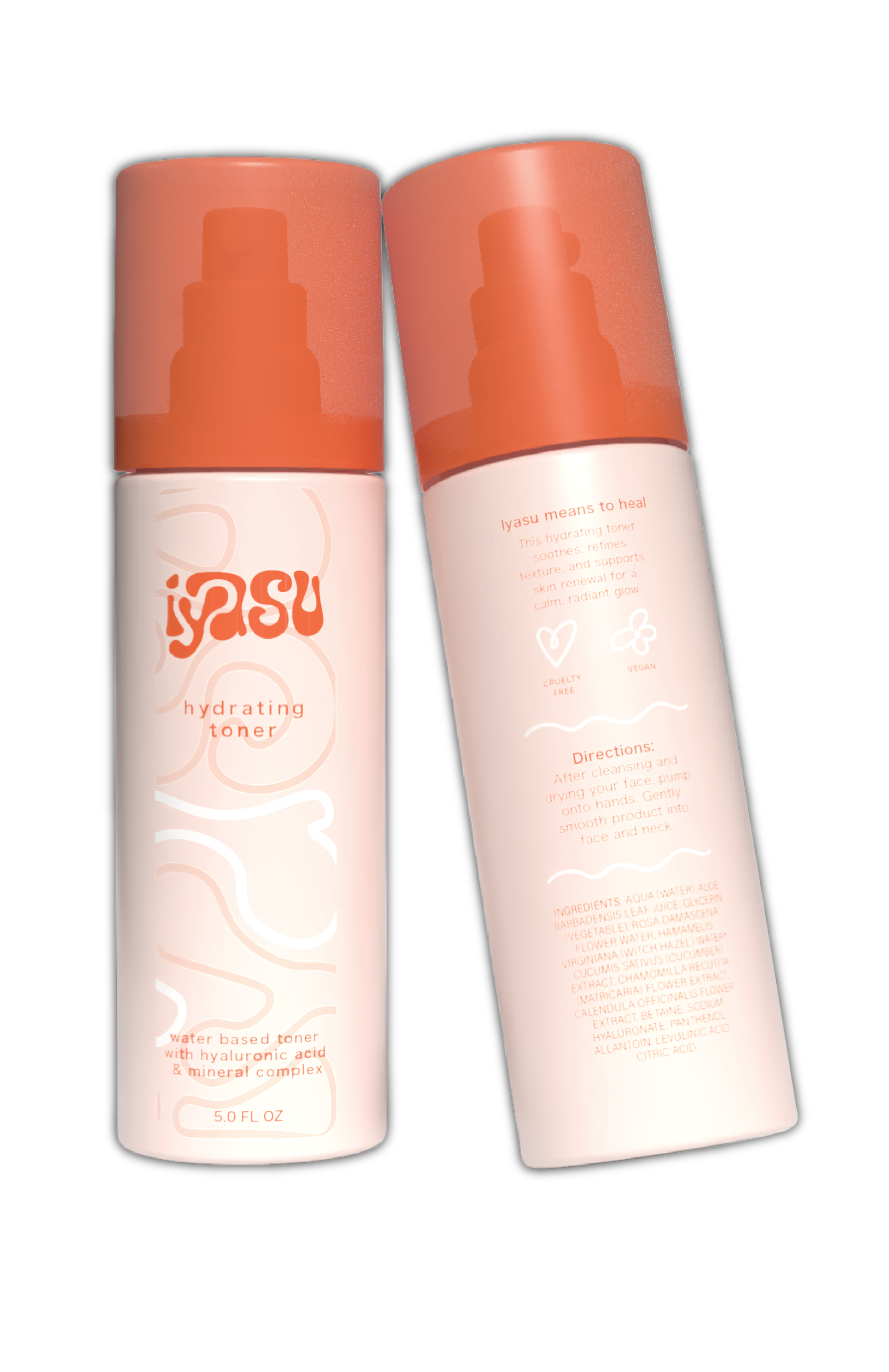
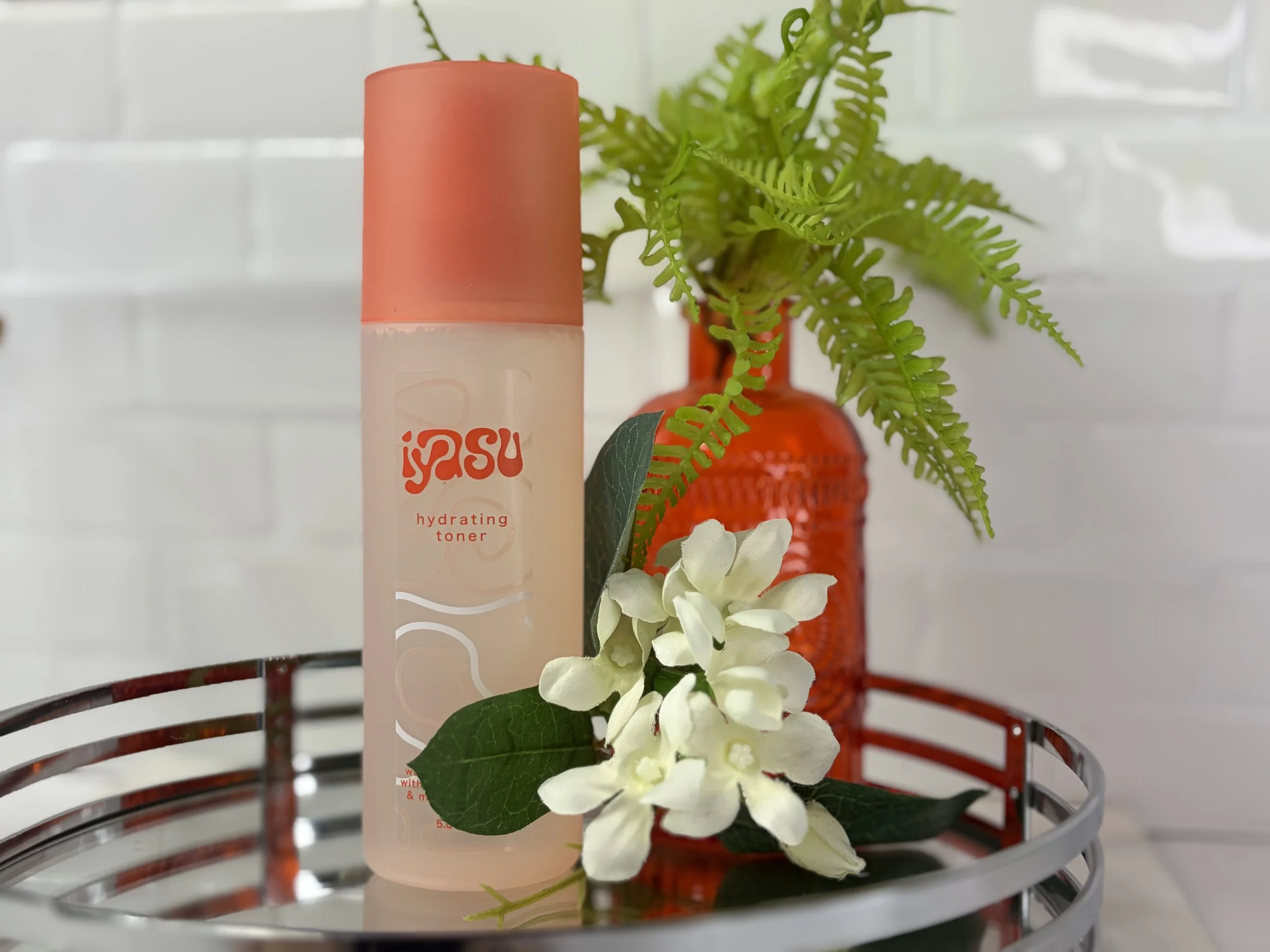
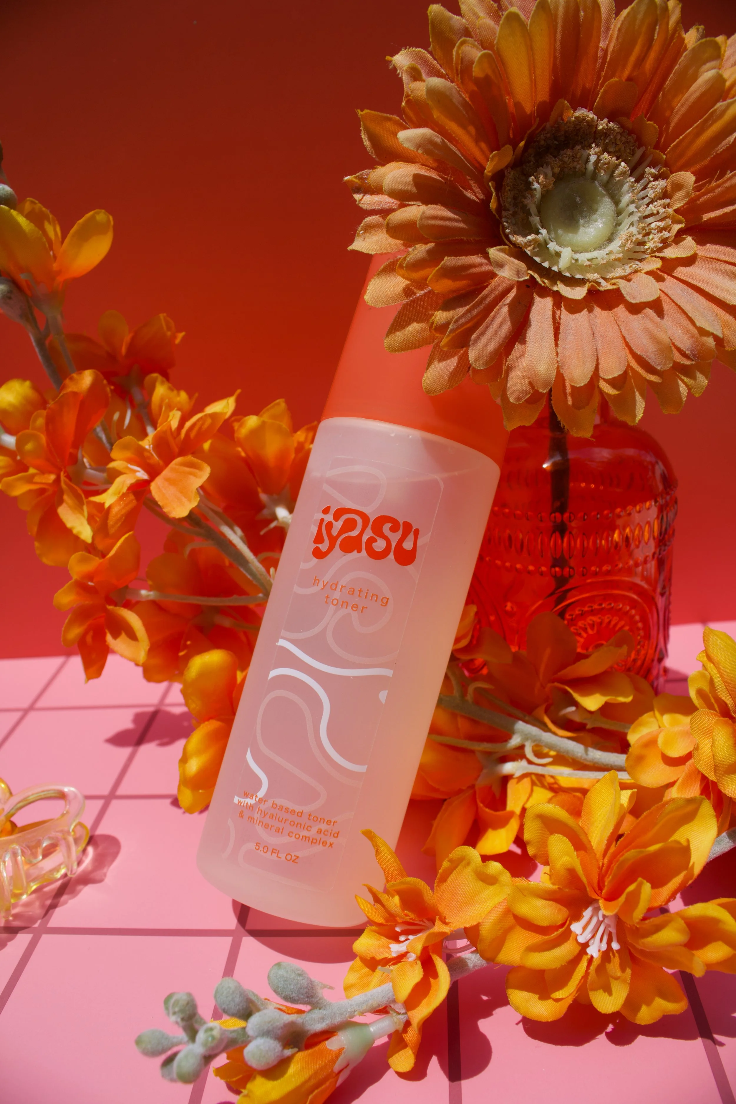
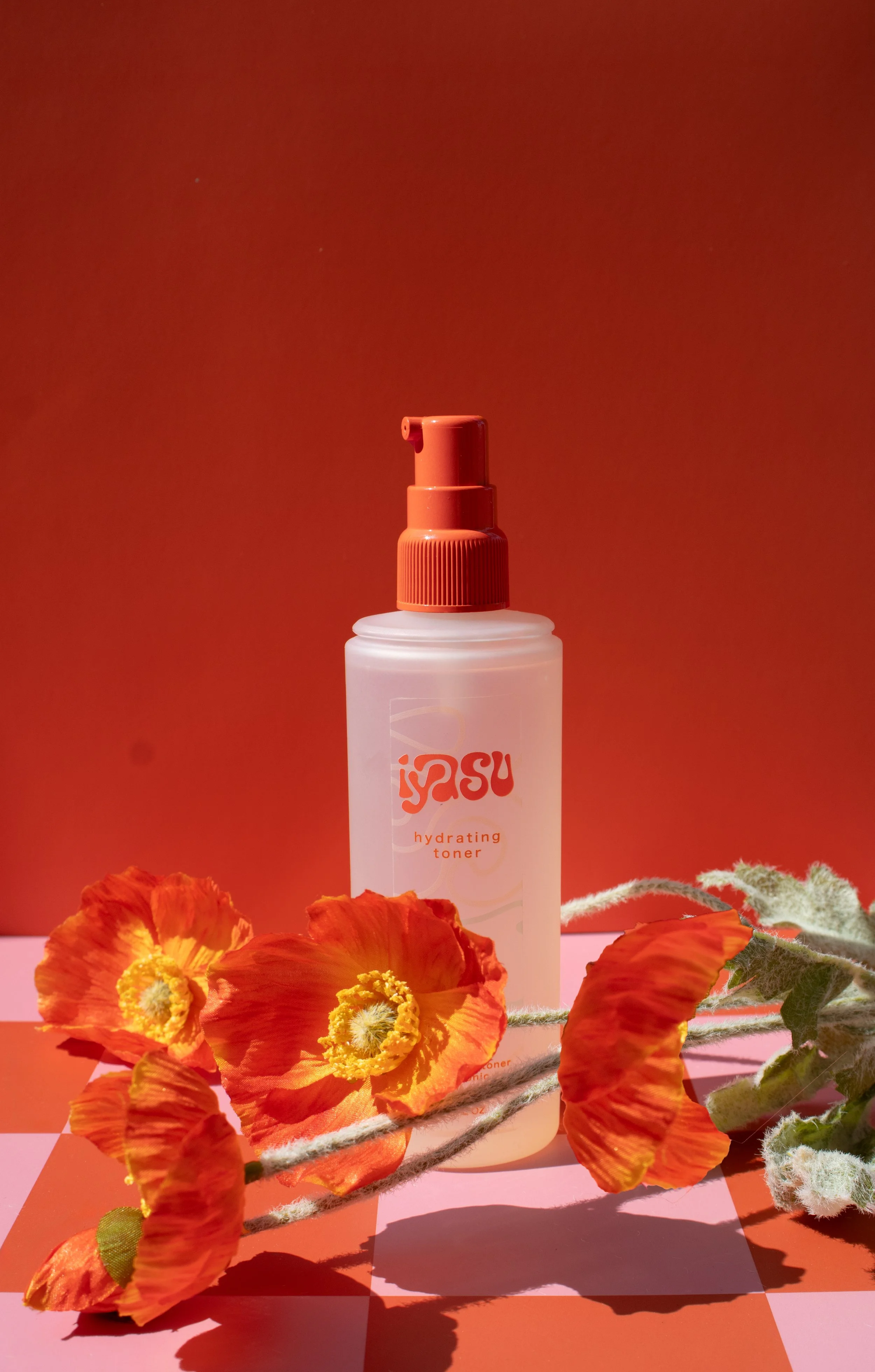
I chose the Iyasu hydrating toner to create into a physical comp. With the help of my mentors at KAO and the wonderful people at 3D color, my design became a reality. For the photography of my product I wanted to mimic a fun bathroom scene. Using a display I purchased I was able to have creative liberty with the backdrop and created a eye-catching environment that makes my composition pop.
website
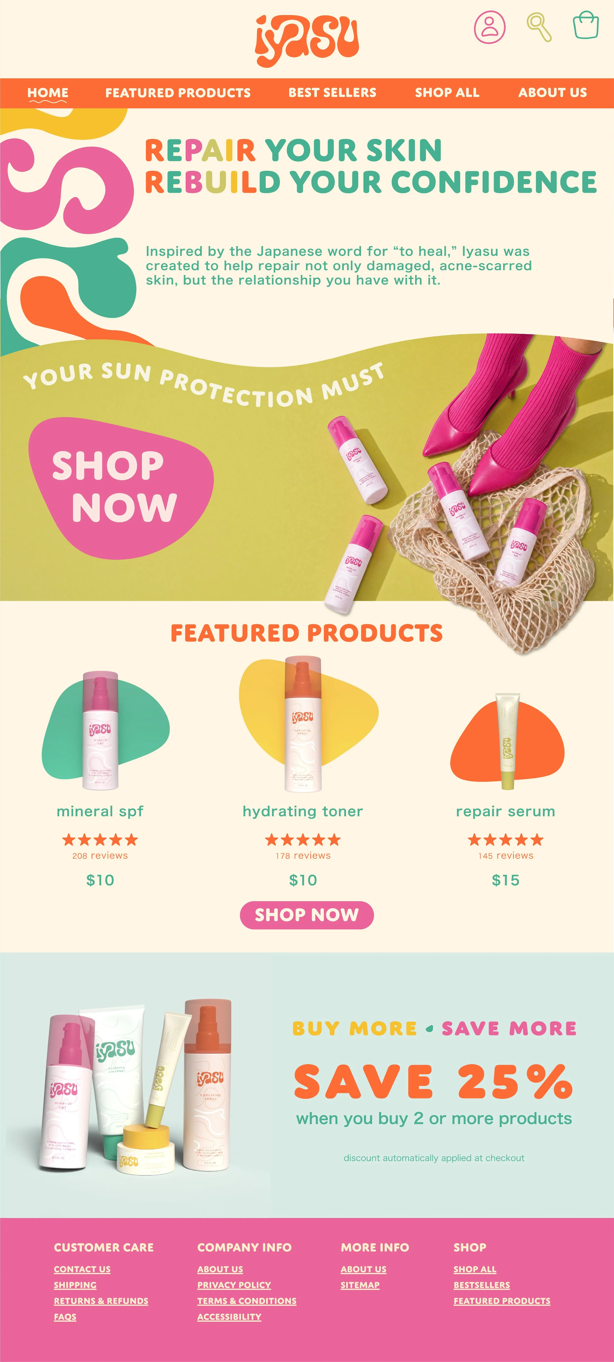
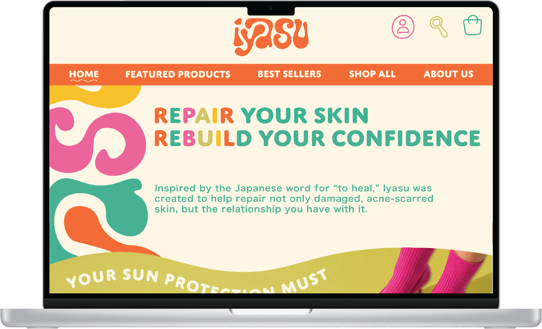
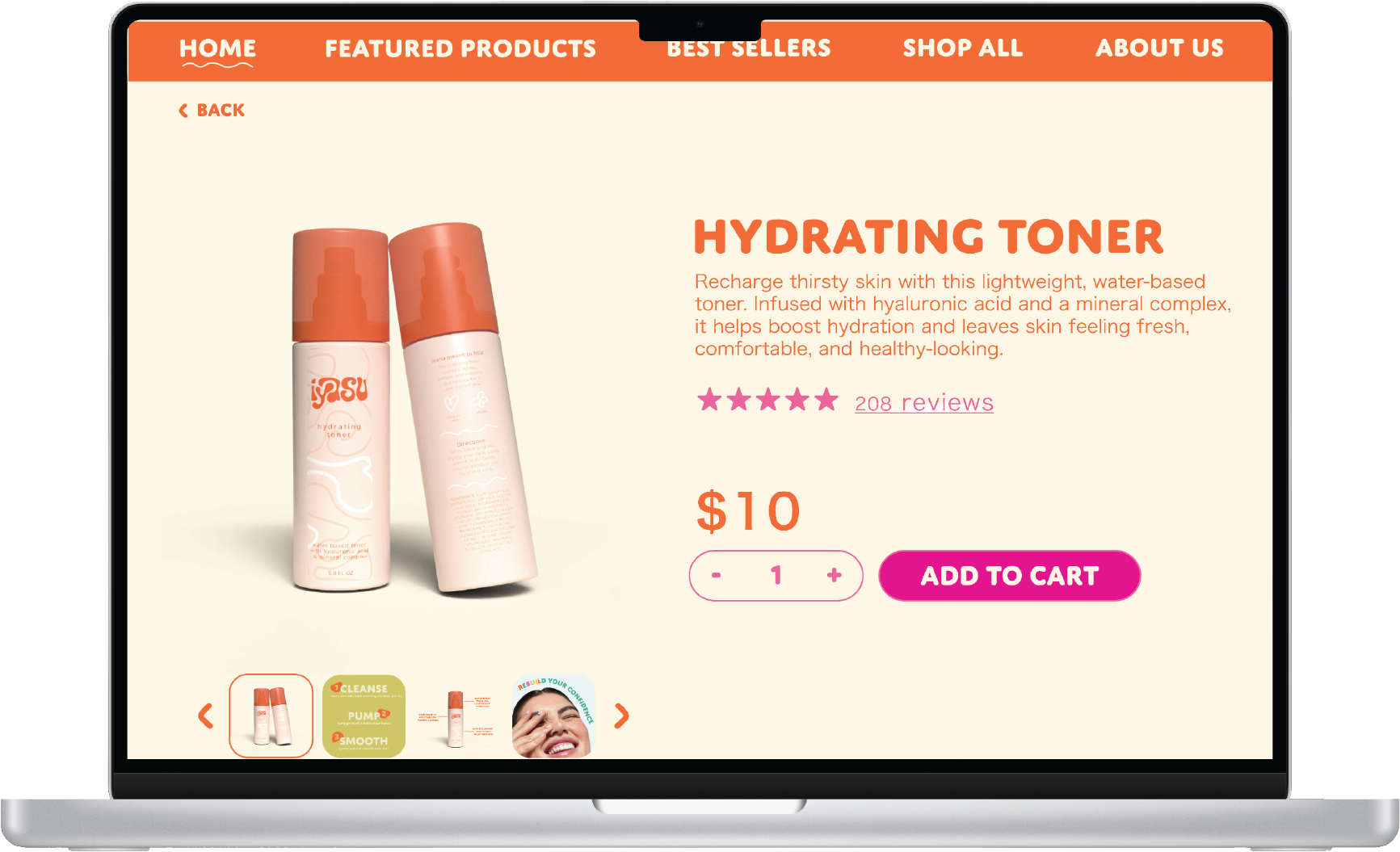
The website was especially fun to build out. Using Illustrator I created an engaging landing page as well as a PDP page. I wanted my website to mimic the purpose of the brand by being playful and break boundaries. Consistently using the logo as a graphic element, as well as bringing in copy that expresses the brand purpose helped achieve this goal.
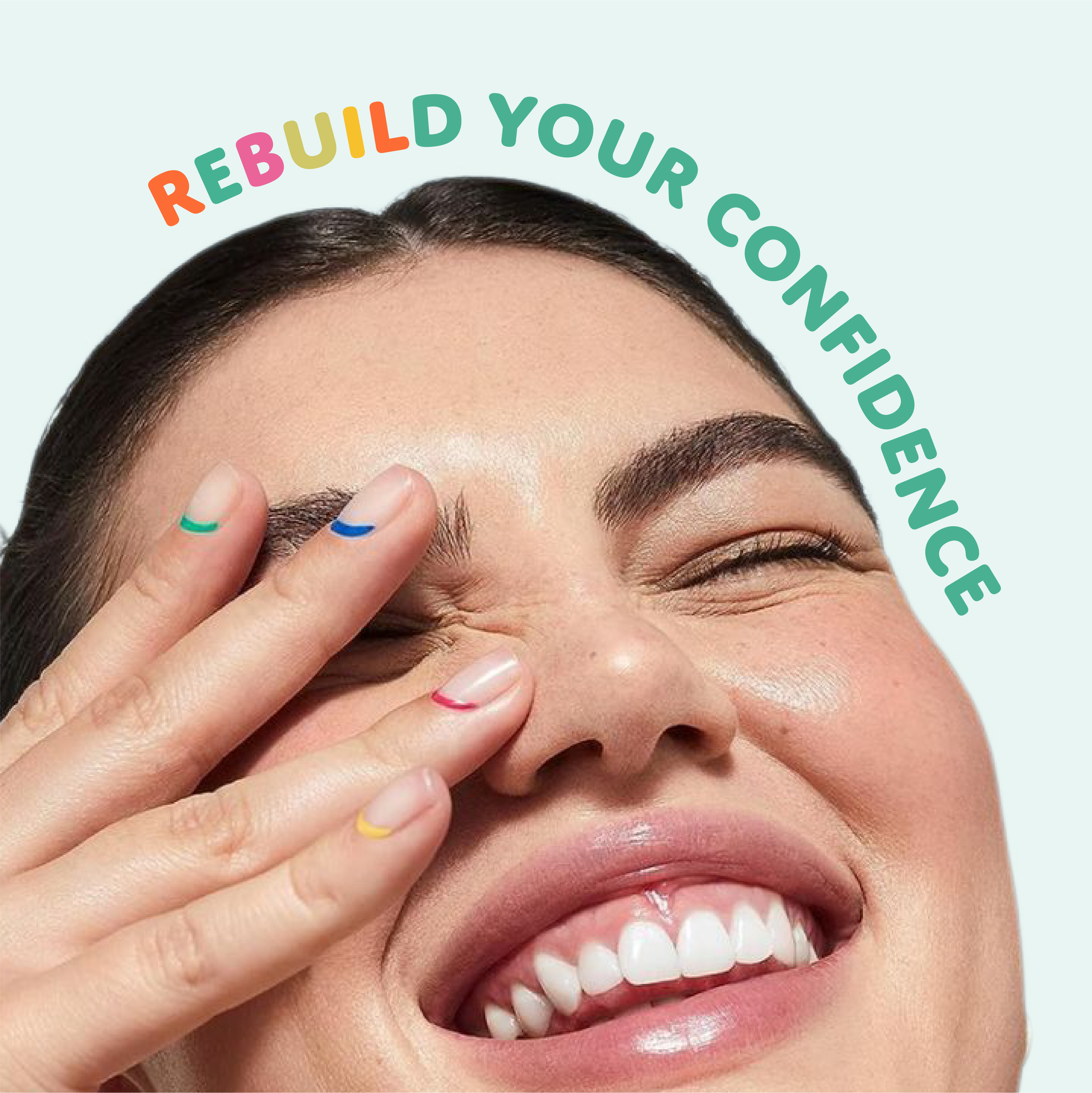
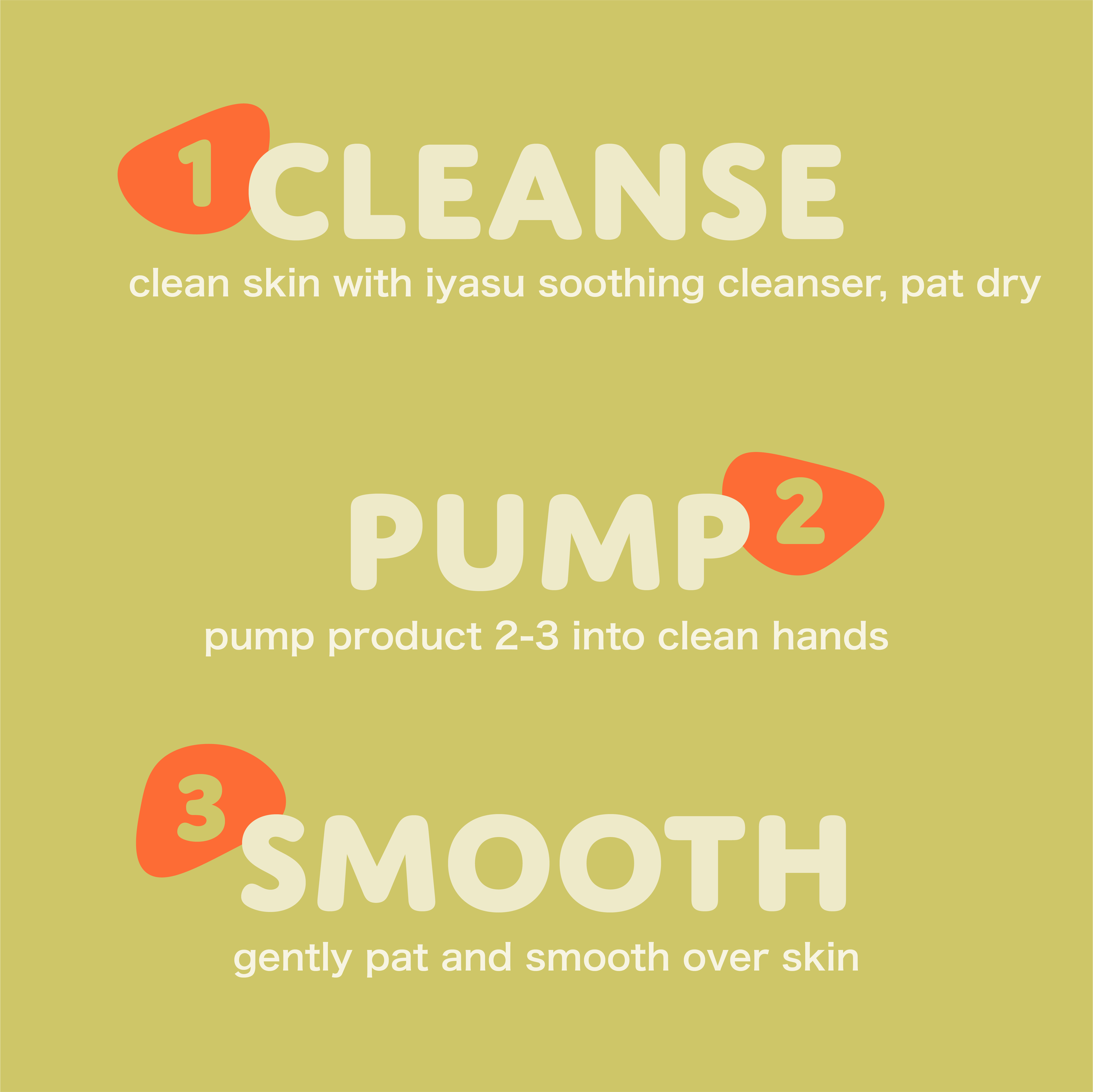
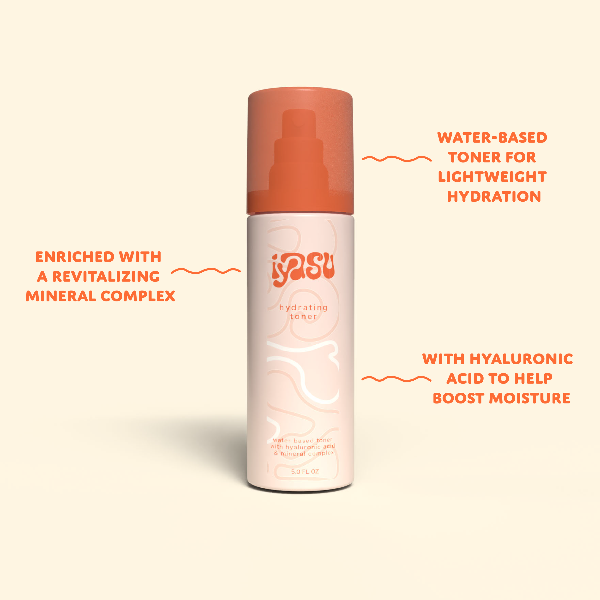
As part of the PDP page, I developed e-content relating to the brand story as well as specifically the hydrating toner product. Breaking down the directions for the toner in one and using the squiggle line element to call out important benefits in another. The center image was sourced from pinterest and I felt the model was a bold expression of the feeling meant to exist around the Iyasu products.
STore Displays
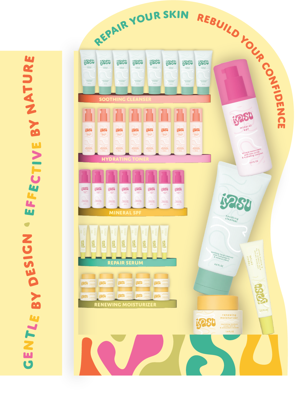
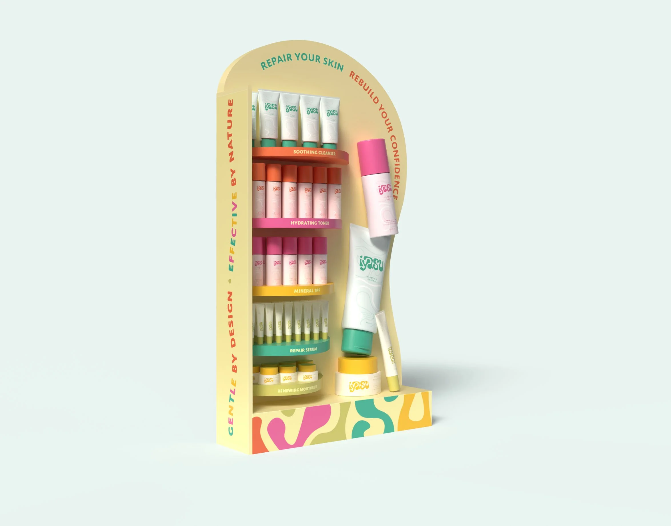
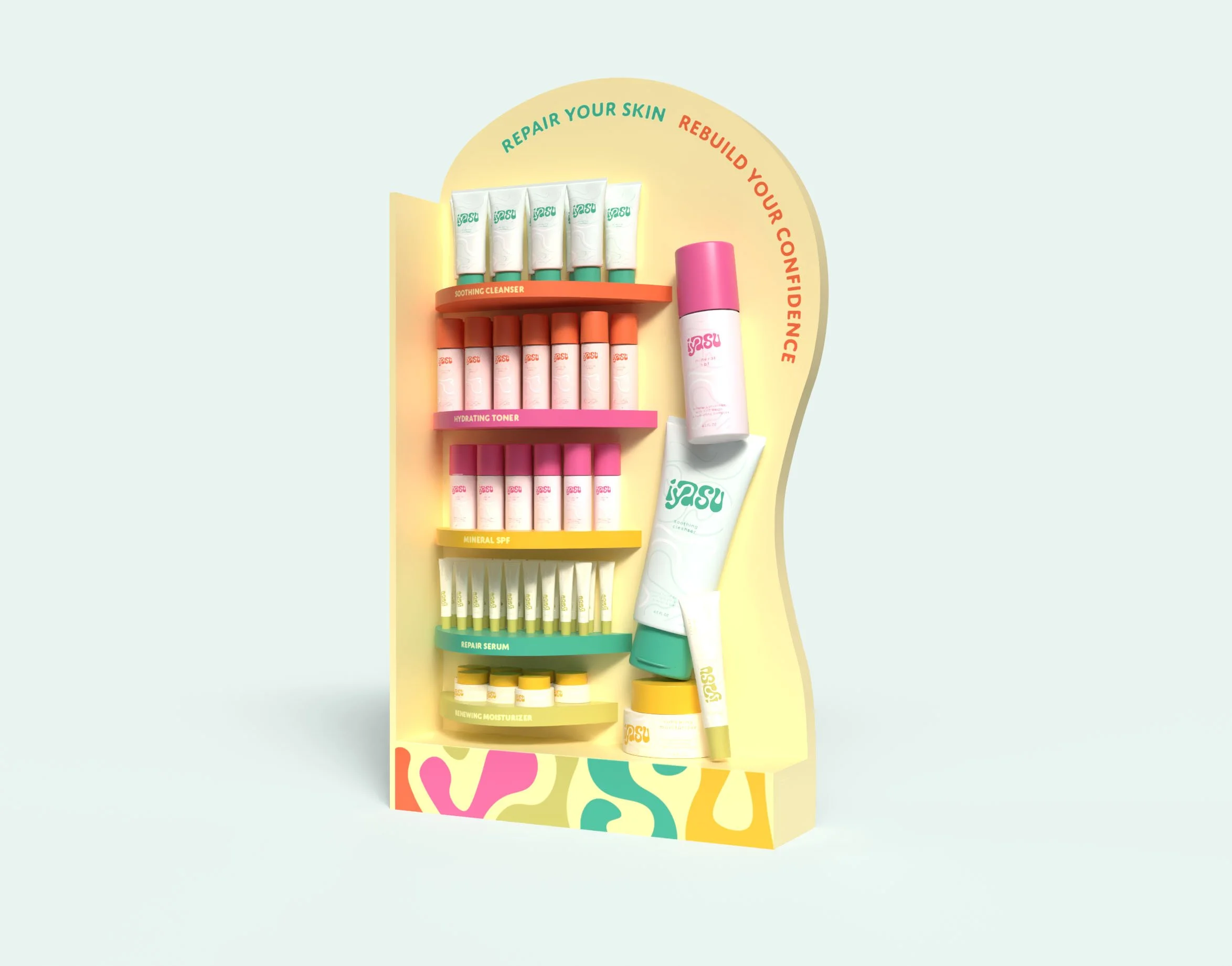
I designed a standing in store display to experiment with possible store presence. The body shape of the display was created through flipping the ‘u’ in the Iyasu logo. This helped to define a nice arch, leaving room for brand related copy. Another fun element is the larger than life products that crawl up the side of the shelf. These bold elements combined with the fun inviting color palette were designed to draw consumers. Both this display and the shelf display below were developed in Adobe dimension.
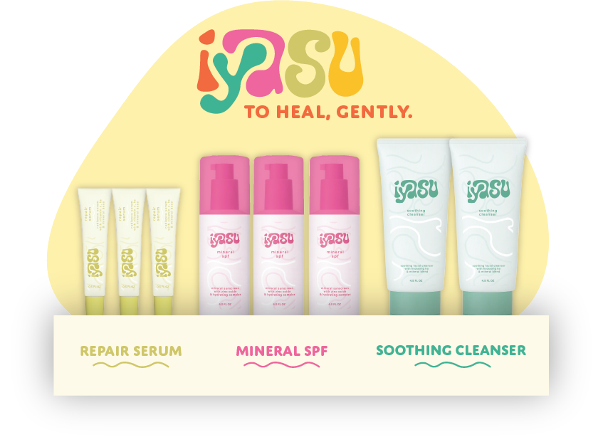
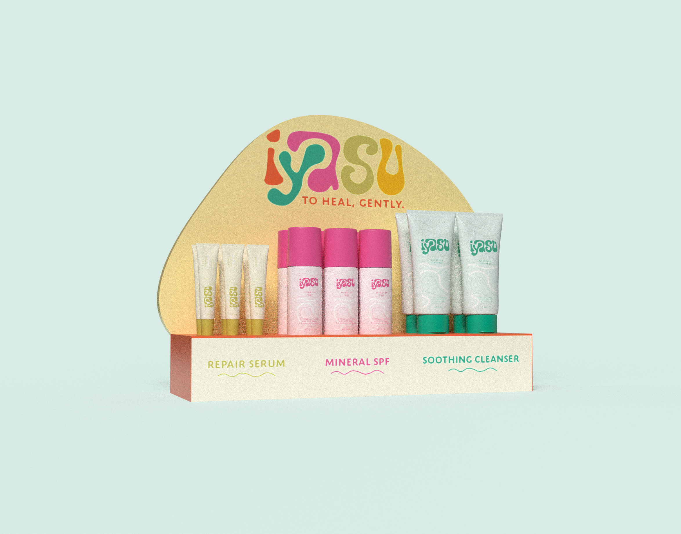
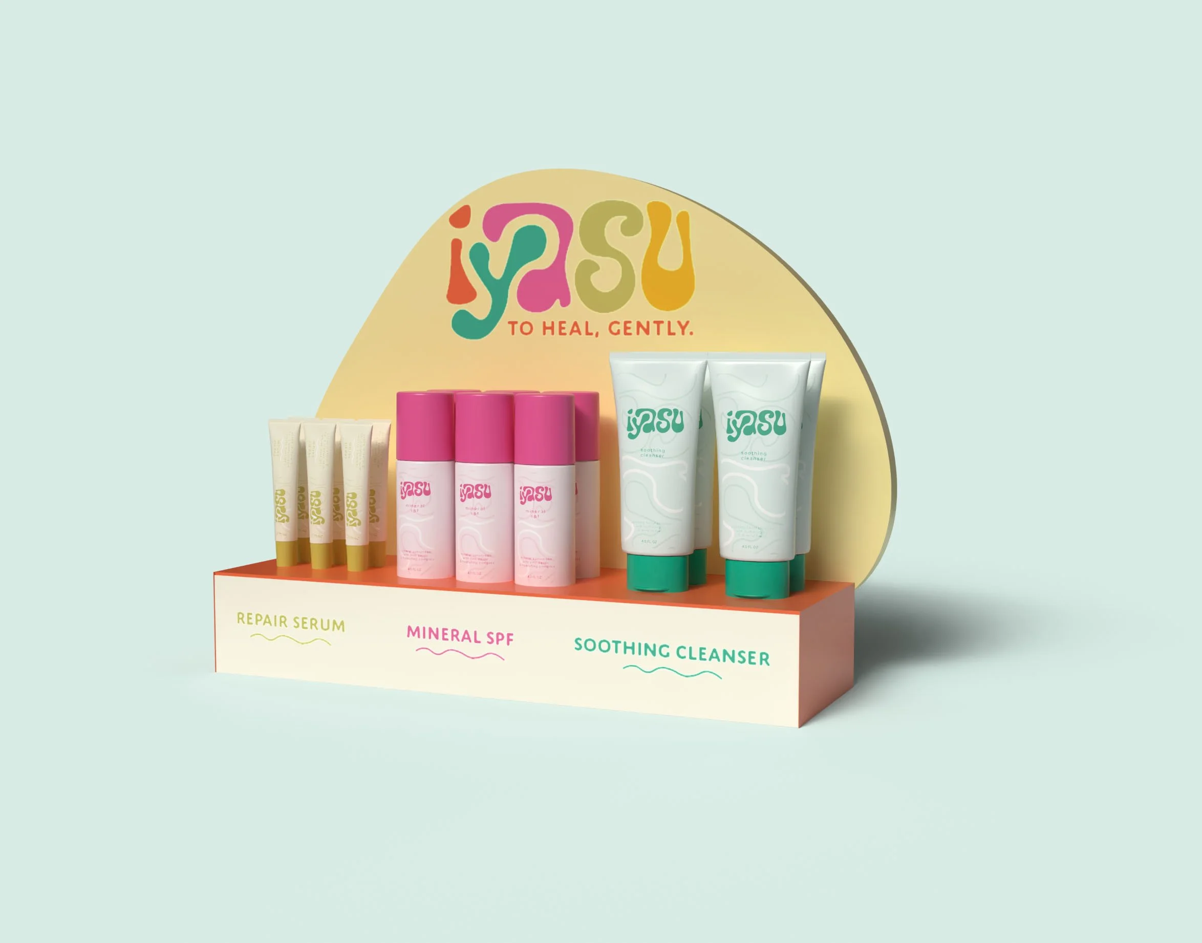
I also designed a shelf display to explore a possible shelf presence. The back was created using the dot from ‘i’ to continue its use as a graphic element. For familiarity sake, I kept the base color a playful yellow. Because the shelf display is smaller, I narrowed the product lineup to the cleanser, SPF, and serum. The product names are listed on the front for clear view. Finally, I included the logo along with the brand purpose above the products to draw in consumers.
view more