NHM Redesign
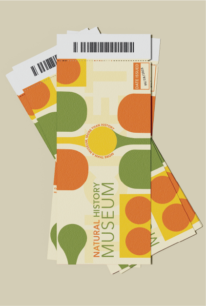
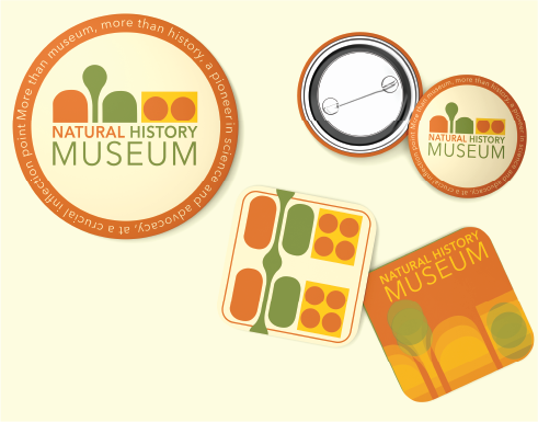
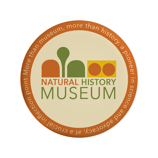
For my Graphic Design 1 course during the summer of 2025, we were assigned a project of rebranding a museum of our choice. Because of my passion for nature and love of dinosaurs, I chose to rebrand the Natural History museum located in London.
moodboard
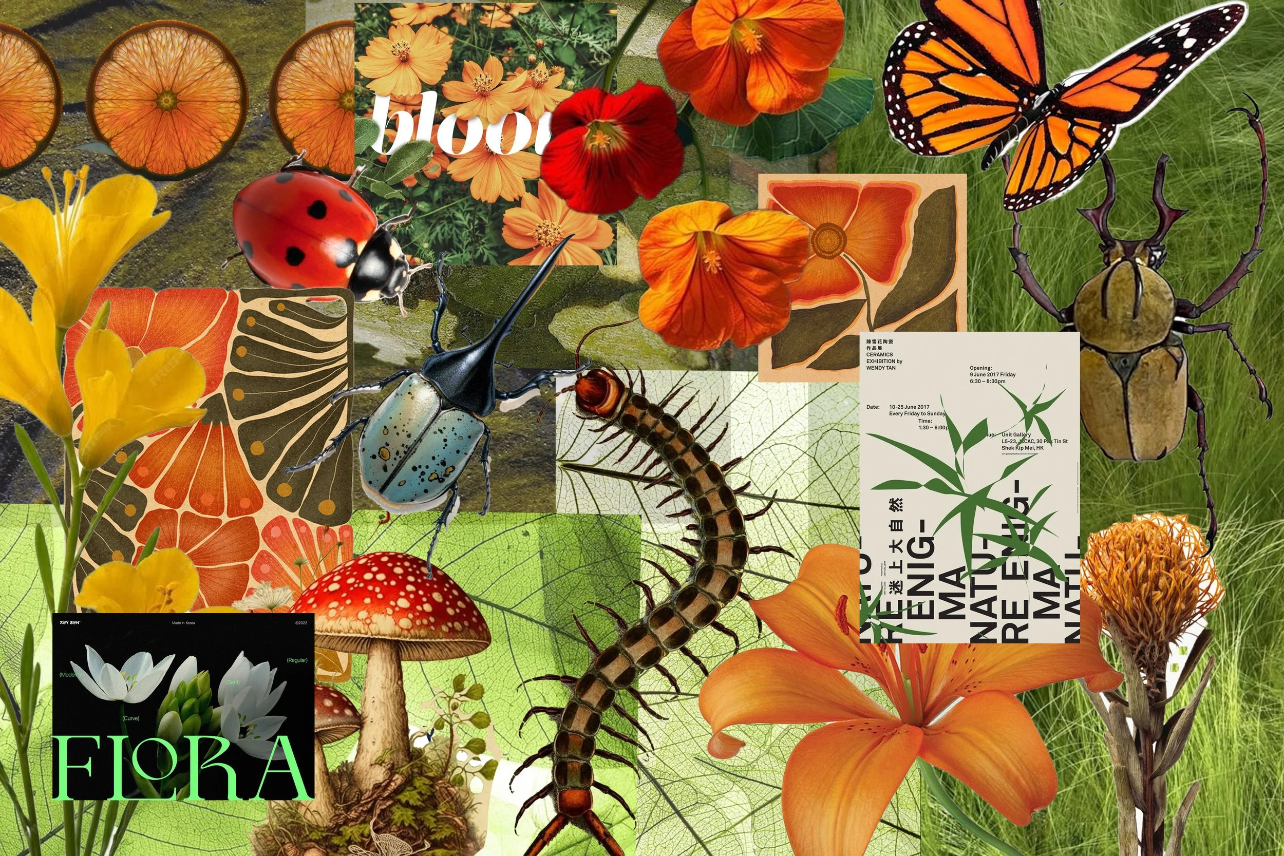
I knew I wanted my rebrand to be engaging and eye-catching while utilizing bright beautiful colors that show up in nature.
logo
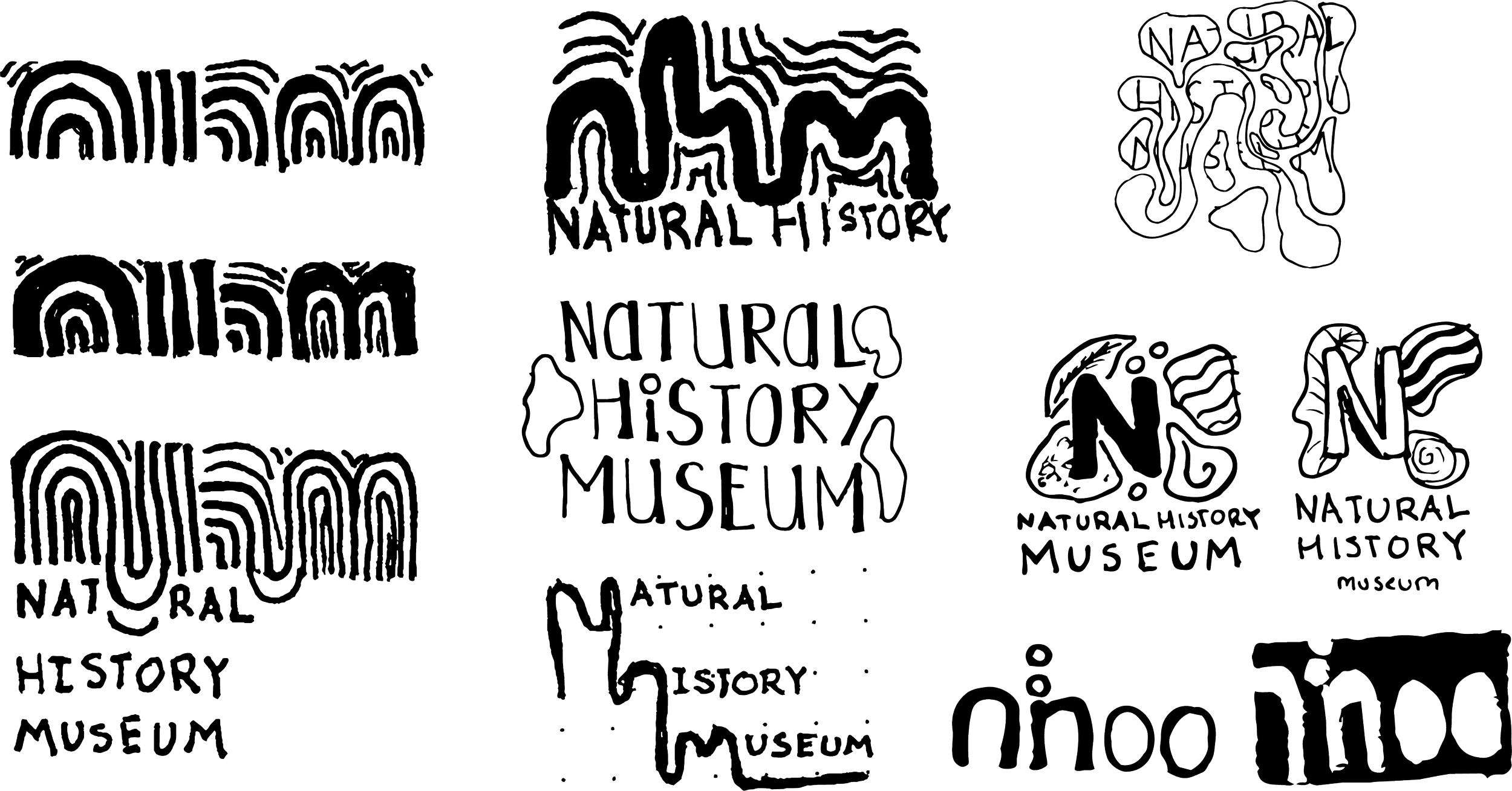
my logo design process always starts with a hand drawn sketch, which enables me to organize my thoughts. I initially was exploring incorporating how history shows up in nature, like the rings in trees that tell it’s age, or the warping of rocks over time.
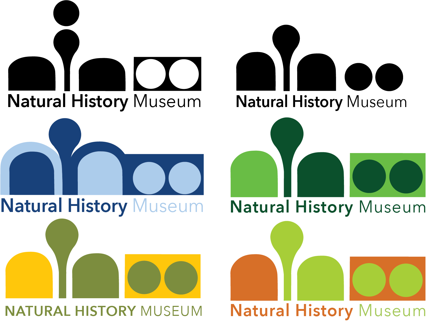
I ultimately went with a more modern, geometric route, simplifying the lettering of NHM into abstract, playful shapes that can double as graphic elements
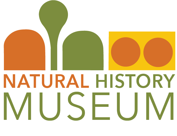
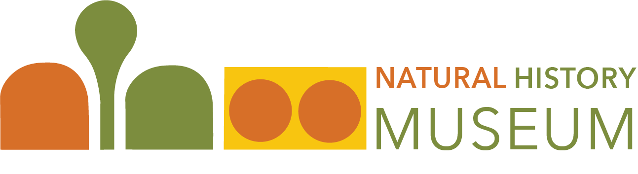
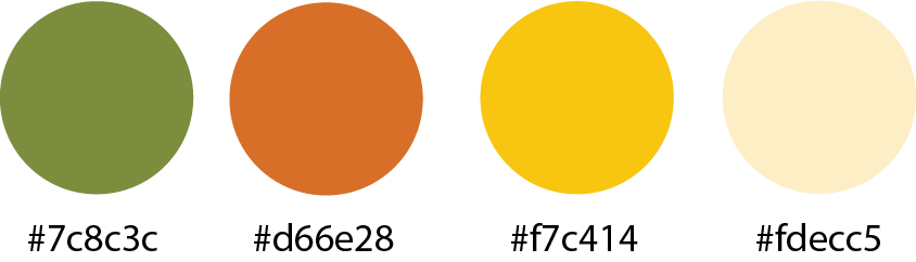
For my final logo, I designed two possible applications to create brand flexibility. I decided on a color palette of bold orange, deep green, and a bright yellow with a cream baseline. The copy is a classic Avenir font to balance out the bold graphic.
poster series
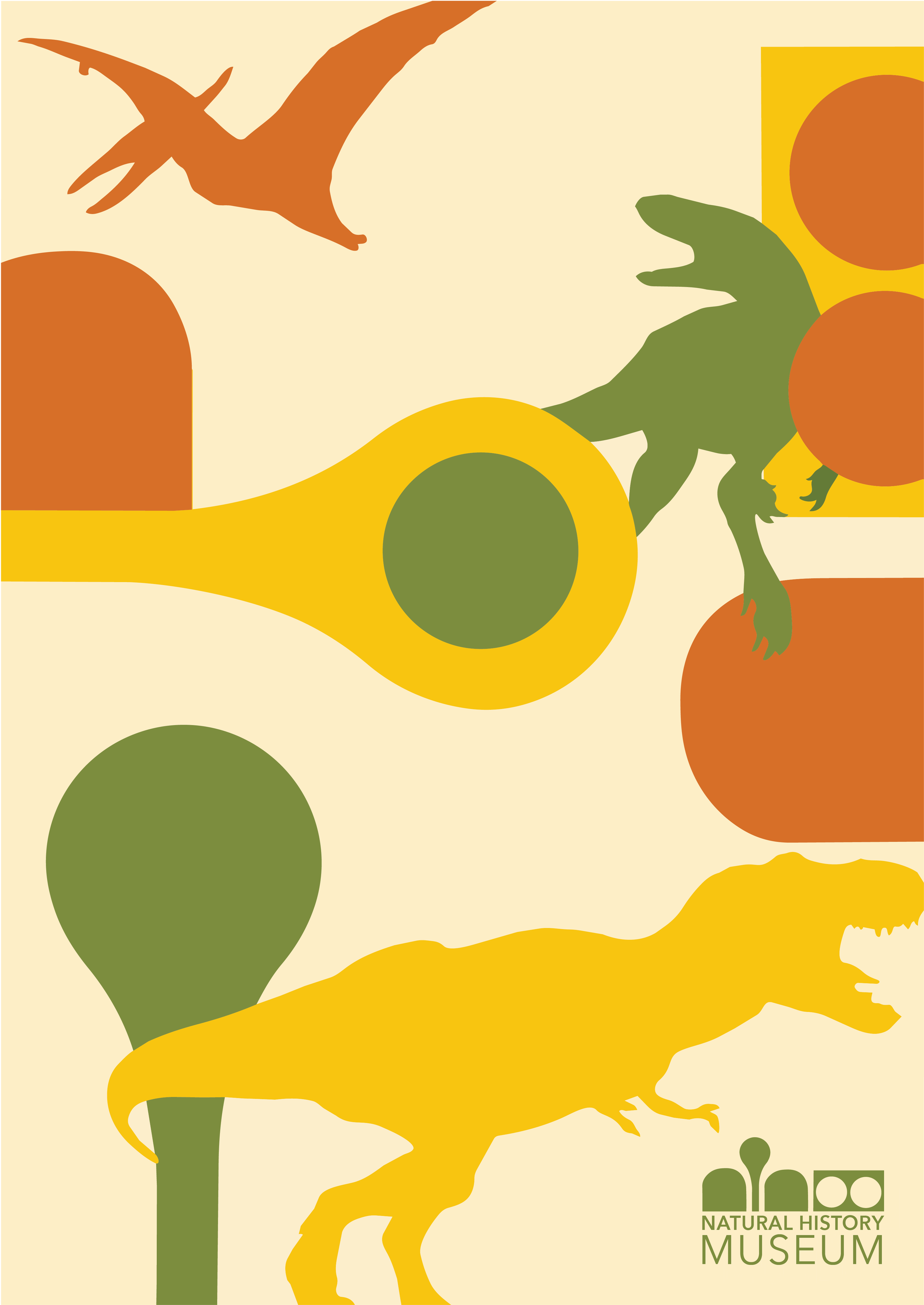
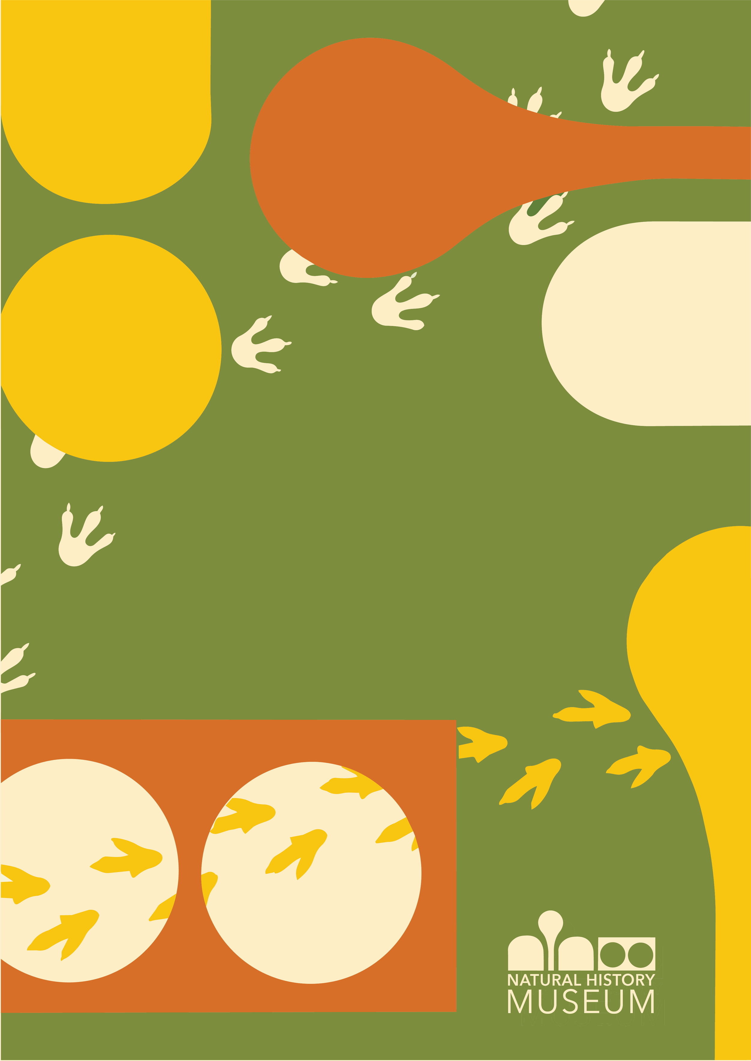
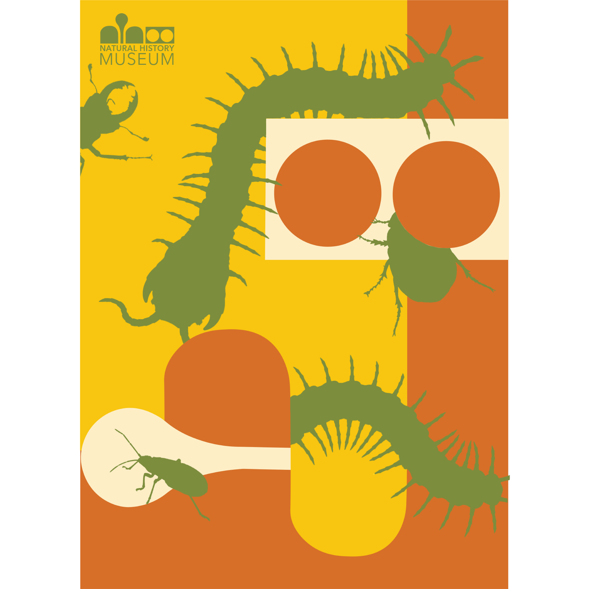
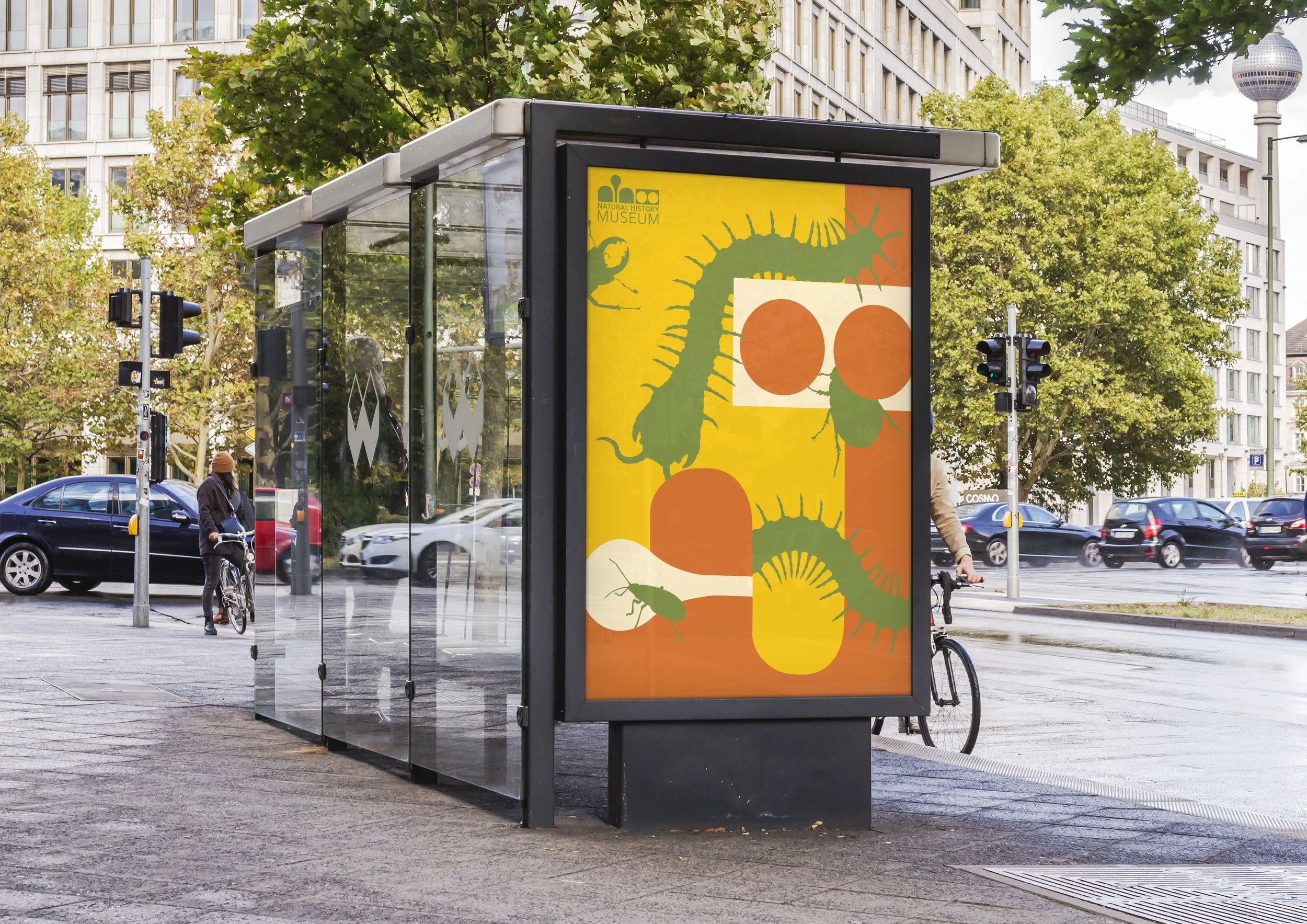
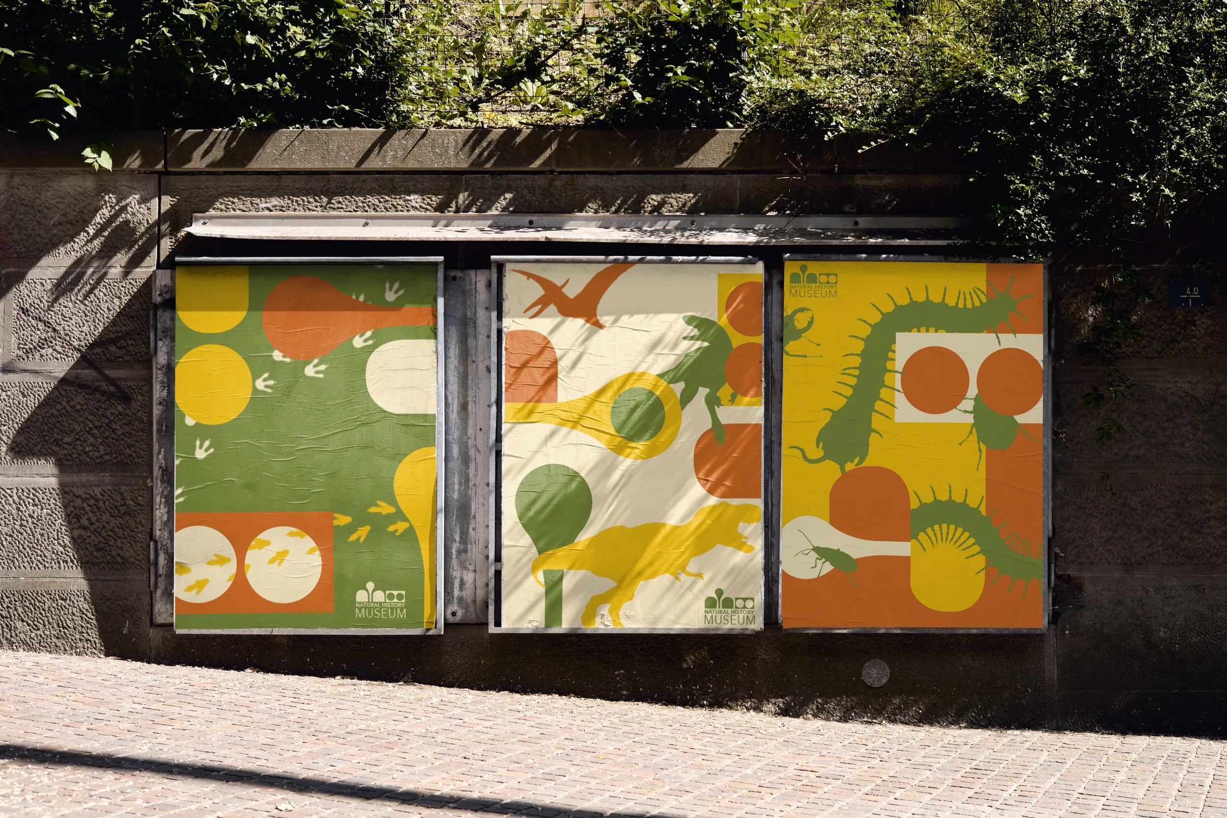
For the poster applications I played around with making using the logo as graphic elements, while incorporating illustrations related to natural history. As for the composition, I experimented with depth by laying all of the graphic elements in fun, challenging ways
Other applications
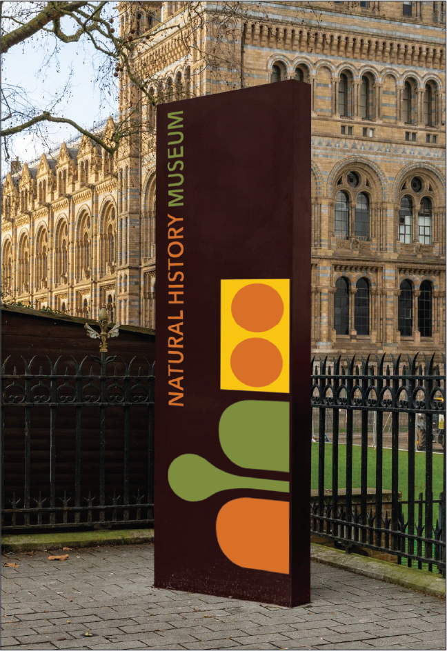
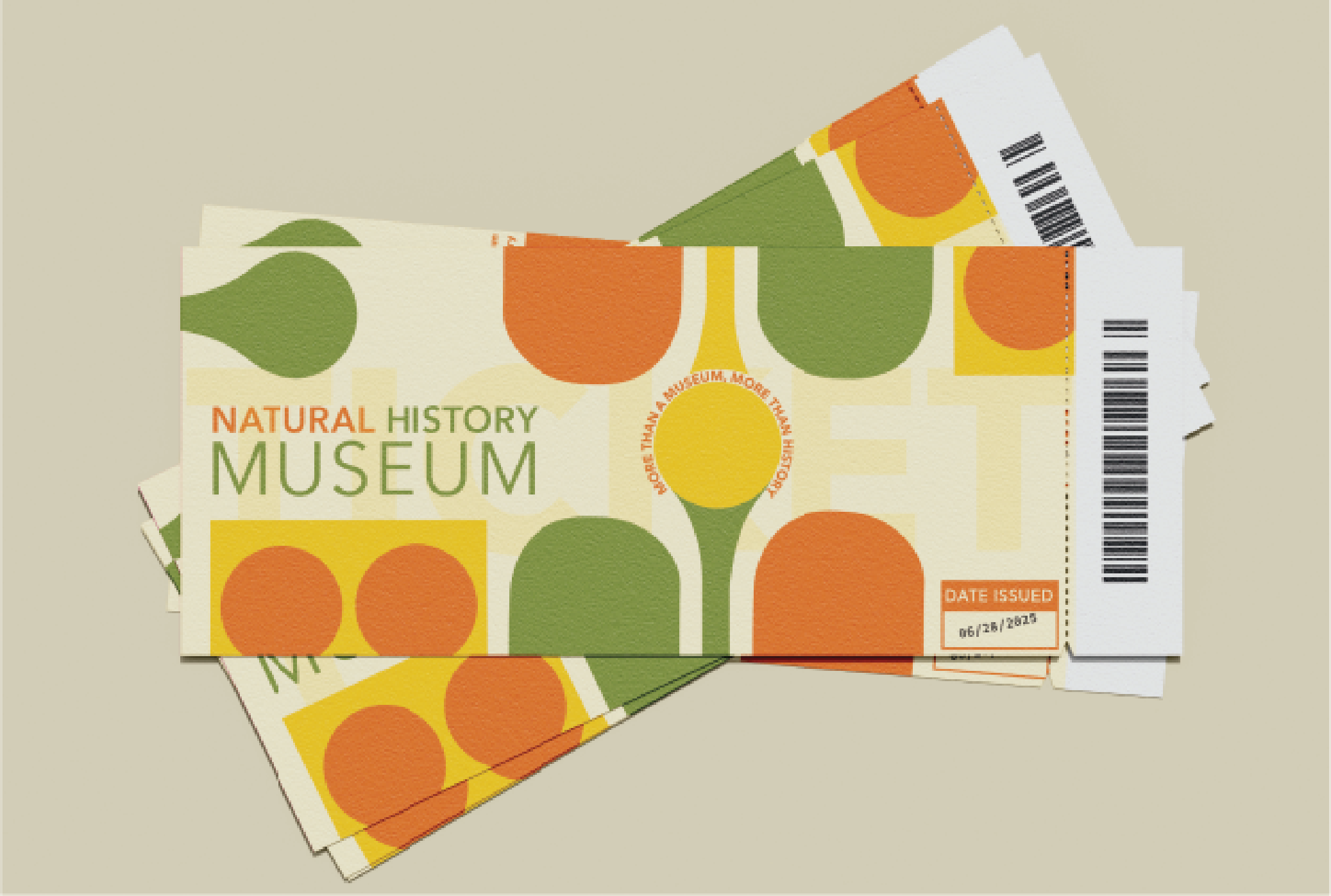
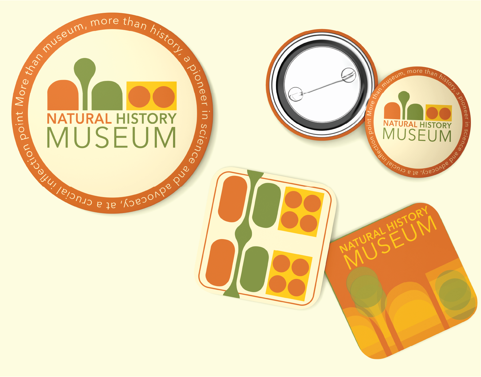
For some final applications, I design museum admission tickets, a set of coasters, and some pins. I also explored what a possible exterior application could look like by altering an actual image of a sign outside of the Natural History Museum.
view more